@fuxinghua
2018-11-15T06:33:46.000000Z
字数 2040
阅读 515
flex布局使用
flex
Flex是什么?
Flex是Flexible Box的缩写,其意为:弹性布局,为盒子模型提供最大的灵活性,目前flex布局已得到所有浏览器的支持,也就意味着可以放心使用,不必考虑兼容性。任何一个容器皆可指定为Flex布局。
前端使用:
.box {
    display: flex;
}
react native 直接使用flex属性即可
.container {
    flex: 1,
    flexDirection: 'row',
    ...
}
Flex概念
采用Flex布局的元素,即为Flex容器,容器内部所有子元素皆为容器成员,遵循Flex布局特性,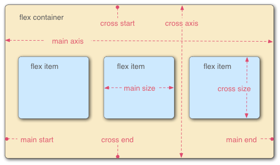
图片引用--阮一峰博客引用链接
Flex存在两个方向轴,水平轴和垂直轴,默认延主轴排列。
Flex容器有以下属性:
- flex-direction
- flex-wrap
- flex-flow
- justify-content
- align-items
- align-content
flex-direction
主轴方向位置,即项目排列方向,有以下几个属性值:
row:默认属性,横向排列
row-reverse:横向反向排列,即逆序排列
column:垂直方向排列
column-reverse:垂直反向排列,即逆序排列
flex-warp
默认情况下,item排列在一条线上,如果排列不完该如何显示,flex-warp就是控制item排列换行显示,包括以下几个属性:
- nowarp:默认值,不换行
- warp:显示不完,在下面另起一行显示
- warp-reverse:显示不完,在上面另起一行显示
justify-content定义主轴对齐方式
- flex-start:主轴开始位置,默认情况下即为左对齐
- flex-end:主轴末尾位置,默认情况下右对齐
- center:居中对齐
- space-between:两端对齐,间隔相等
- space-around:每个项目两侧的间隔相等,所以,项目之间的间隔比项目与边框的间隔大一倍
align-items:次轴上对齐方式
- flex-start:交叉轴的起点对齐
- flex-end:交叉轴的终点对齐
- center:交叉轴的中点对齐
- baseline: 项目的第一行文字的基线对齐
- stretch(默认值):如果项目未设置高度或设为auto,将占满整个容器的高度
Flex在react native中的使用
横向布局
1.横向垂直水平居中布局
2.横向均分布局需设置justifyContent属性值(参考上面)
注:需设置父容器宽度,不然将不会起作用
import React, {Component} from 'react';
import {View, Text, Dimensions} from 'react-native';
const {height, width} =  Dimensions.get('window');

export default class FlexComponent extends Component{
    render() {
        return <View>
            <View style={{marginTop: 50, flexDirection: 'row', justifyContent: 'space-between', alignItems: 'center', width: width, height:100, backgroundColor: 'gray'}}>
                <View style={{width: 50, height: 20, backgroundColor: 'red'}}></View>
                <View style={{width: 50, height: 20, backgroundColor: 'green'}}></View>
                <View style={{width: 50, height: 20, backgroundColor: 'blue'}}></View>
            </View>
        </View>
    }
}
垂直布局
<View style={{marginTop: 50, flexDirection: 'column', justifyContent: 'space-between', alignItems: 'center', width: width, height:100, backgroundColor: 'gray'}}>
                <View style={{width: 50, height: 20, backgroundColor: 'red'}}></View>
                <View style={{width: 50, height: 20, backgroundColor: 'green'}}></View>
                <View style={{width: 50, height: 20, backgroundColor: 'blue'}}></View>
            </View>
总结
以上只是简单介绍一下flex属性,以及结合react native项目做一个简单的布局实例。遇到复杂的布局,可以按照分层布局嵌套的方式实现更加复杂的布局,以实现想要的布局。这里只是做一个简单的demo更复杂的布局依然可以基于这两种简单布局实现。
