@nemos
2017-05-08T11:12:48.000000Z
字数 4931
阅读 1636
matplotliib
ml
参考
快速入门
import matplotlib.pyplot as pltimport numpy as np
函数式绘图
画布
# 生成数据x = np.linspace(-1, 1, 50)y1 = 2 * x + 1y2 = x ** 2# 新建画布,一个画布对于了一个窗口plt.figure()# 以下绘图操作都会在这个创建的这个画布上呈现plt.plot(x, y2)plt.plot(x, y1, color='red', linewidth=1.0, linestyle='--')# 显示图像plt.show()# 再建一个画布plt.figure()# 同理plt.plot(x, y1)plt.show()
画布一
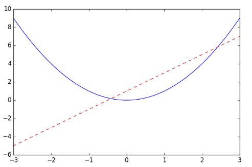
画布二

坐标
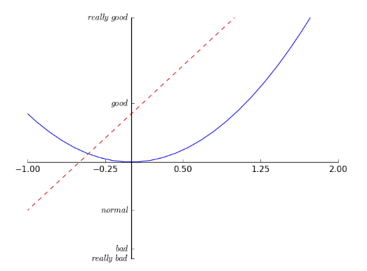
plt.figure()# 设置坐标范围plt.xlim((-1, 2))plt.ylim((-2, 3))# 设置坐标名称plt.xlabel('I am x')plt.ylabel('I am y')# 刻度设置new_ticks = np.linspace(-1, 2, 5) # -1到2的五个刻度六个间距plt.xticks(new_ticks)plt.yticks([-2, -1.8, -1, 1.22, 3],[r'$really\ bad$', r'$bad$', r'$normal$', r'$good$', r'$really\ good$']) # 文字刻度# get current axisax = plt.gca() # 一个坐标有四个轴# 获得右坐标轴ax.spines['right'].set_color('none') # none使其不可见ax.spines['top'].set_color('none')# x轴设置成下坐标轴ax.xaxis.set_ticks_position('bottom')# 移动坐标轴使其在y=0的位置ax.spines['bottom'].set_position(('data', 0))
图例
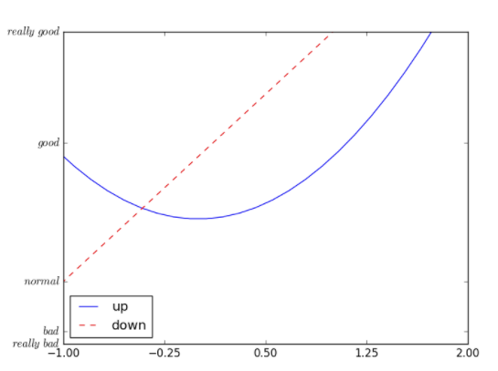
# 可以在绘制时指定labell1, = plt.plot(x, y2, label='linear line')l2, = plt.plot(x, y1, color='red', linewidth=1.0, linestyle='--', label='square line')# 指定图例的线,标签,和位置plt.legend(handles=[l1, l2], labels=['up', 'down'], loc='best')
注解
# 绘制直线plt.plot(x, y1)# 设置要标注的点x0 = 1y0 = 2*x0 + 1# 绘制标注的点plt.scatter([x0, ], [y0, ], s=50, color='b')# 到X轴的虚线plt.plot([x0, x0,], [0, y0,], 'k--', linewidth=2.5)# 绘制标注plt.annotate(r'$2x+1=%s$' % y0, # 要标注的文字xytext=(+30, -30), # 文字的的位置textcoords='offset points', # 文字位置的基准xy=(x0, y0), # 标注的位置xycoords='data', # 标注位置的基准fontsize=16,arrowprops=dict( # 箭头样式arrowstyle='->',connectionstyle="arc3,rad=.2"))# 绘制文字plt.text(-3.7, 3, # 位置r'$This\ is\ the\ some\ text. \mu\ \sigma_i\ \alpha_t$', # 文字fontdict={'size': 16, 'color': 'r'}) # 字体

对象式绘图
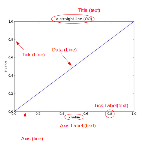
from matplotlib.figure import Figurefrom matplotlib.backends.backend_agg import FigureCanvasAgg as FigureCanvasfig = Figure()canvas = FigureCanvas(fig)ax = fig.add_axes([0.1, 0.1, 0.8, 0.8])line, = ax.plot([0,1], [0,1])ax.set_title("a straight line (OO)")ax.set_xlabel("x value")ax.set_ylabel("y value")canvas.print_figure('demo.jpg')

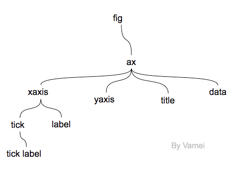
层次说明
注:canvas为画图的引擎,这里的层次指的是逻辑的层次
进阶说明
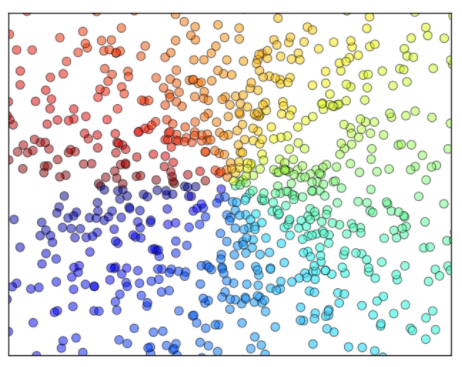
散点图
n = 1024 # 数据大小# 正态分布生成X = np.random.normal(0, 1, n) # 每一个点的X值Y = np.random.normal(0, 1, n) # 每一个点的Y值T = np.arctan2(Y,X) # for color valueplt.scatter(X, Y,s=75,c=T, # 色彩mapalpha=.5) # 透明度plt.xlim(-1.5, 1.5)plt.xticks(()) # ignore xticksplt.ylim(-1.5, 1.5)plt.yticks(()) # ignore yticksplt.show()
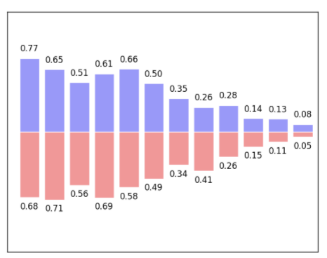
柱状图
# 数据生成n = 12X = np.arange(n)Y1 = (1 - X / float(n)) * np.random.uniform(0.5, 1.0, n)Y2 = (1 - X / float(n)) * np.random.uniform(0.5, 1.0, n)# 设置颜色和正反向绘图plt.bar(X, +Y1, facecolor='#9999ff', edgecolor='white')plt.bar(X, -Y2, facecolor='#ff9999', edgecolor='white')# 坐标设置plt.xlim(-.5, n)plt.xticks(())plt.ylim(-1.25, 1.25)plt.yticks(())# 显示每个柱的数值for x, y in zip(X, Y1):# ha: horizontal alignment# va: vertical alignmentplt.text(x + 0.4, y + 0.05, '%.2f' % y, ha='center', va='bottom')for x, y in zip(X, Y2):plt.text(x + 0.4, -y - 0.05, '%.2f' % y, ha='center', va='top')plt.show()
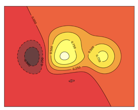
等高线
# 高度函数def f(x,y):return (1 - x / 2 + x**5 + y**3) * np.exp(-x**2 -y**2)n = 256x = np.linspace(-3, 3, n)y = np.linspace(-3, 3, n)X,Y = np.meshgrid(x, y)i# 颜色填充plt.contourf(X, Y, f(X, Y), # 坐标8, # 由等高线分成多少部分alpha=.75, # 透明度cmap=plt.cm.hot) # 颜色主题# 等高线plt.contourf(X, Y, f(X, Y), 8, alpha=.75, cmap=plt.cm.hot)# 在线上添加labelplt.clabel(C, inline=True, fontsize=10)# 去掉坐标plt.xticks(())plt.yticks(())
图像
pic = np.array([0.313660827978, 0.365348418405, 0.423733120134,0.365348418405, 0.439599930621, 0.525083754405,0.423733120134, 0.525083754405, 0.651536351379]).reshape(3,3)# 显示图片plt.imshow(a, interpolation='nearest', cmap='bone', origin='lower')# 添加标注plt.colorbar(shrink=.92)

3D图
from mpl_toolkits.mplot3d import Axes3D
fig = plt.figure()# 添加3D坐标轴ax = Axes3D(fig)# 数据生成X = np.arange(-4, 4, 0.25)Y = np.arange(-4, 4, 0.25)# x-y 平面的网格X, Y = np.meshgrid(X, Y)R = np.sqrt(X ** 2 + Y ** 2)Z = np.sin(R)# 生成曲面ax.plot_surface(X, Y, Z,rstride=1, # row栅格的跨度cstride=1, # column同上cmap=plt.get_cmap('rainbow')) # 色彩主题ax.contourf(X, Y, Z,zdir='z', # 指定从Z轴的投影offset=-2,cmap=plt.get_cmap('rainbow'))plt.show()
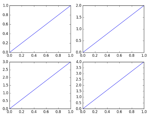
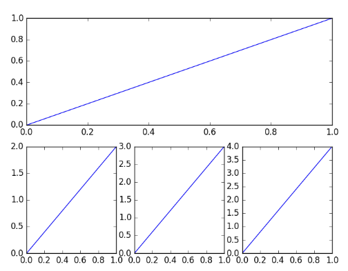
子画布
plt.figure()# 创建子画布plt.subplot(2,2,1) # 画第一个子画布plt.plot([0,1],[0,1])plt.subplot(2,2,2) # 画第二个子画布plt.plot([0,1],[0,2])plt.subplot(223)plt.plot([0,1],[0,3])plt.subplot(224)plt.plot([0,1],[0,4])plt.show()
plt.figure()# 创建子画布plt.subplot(2,1,1) # 使第一个画布占满第一行的三列plt.plot([0,1],[0,1])plt.subplot(2,3,4) # 从第四个格子开始排plt.plot([0,1],[0,2])plt.subplot(235)plt.plot([0,1],[0,3])plt.subplot(236)plt.plot([0,1],[0,4])plt.show()
图中图
fig = plt.figure()x = [1, 2, 3, 4, 5, 6, 7]y = [1, 3, 4, 2, 5, 8, 6]# 绘制大图left, bottom, width, height = 0.1, 0.1, 0.8, 0.8ax1 = fig.add_axes([left, bottom, width, height])ax1.plot(x, y, 'r')ax1.set_xlabel('x')ax1.set_ylabel('y')ax1.set_title('title')# 绘制小图left, bottom, width, height = 0.2, 0.6, 0.25, 0.25ax2 = fig.add_axes([left, bottom, width, height])ax2.plot(y, x, 'b')ax2.set_xlabel('x')ax2.set_ylabel('y')ax2.set_title('title inside 1')
动画
from matplotlib import animation
fig, ax = plt.subplots()# 生成正弦曲线x = np.arange(0, 2*np.pi, 0.01)line, = ax.plot(x, np.sin(x))# 定义动画函数,接受一个帧数参数def animate(i):line.set_ydata(np.sin(x + i/10.0))return line,# 开始帧def init():line.set_ydata(np.sin(x))return line,ani = animation.FuncAnimation(fig=fig, # 指定figurefunc=animate, # 动画函数frames=100, # 动画长度init_func=init, # 开始帧interval=20, # 更新频率,ms为单位blit=False) # mac用falseplt.show()# 保存动画anim.save('basic_animation.mp4', fps=30, extra_args=['-vcodec', 'libx264'])
引用
莫烦python-Matplotlib
绘图: matplotlib核心剖析
matplotlib - 2D and 3D plotting in Python
利用plotly for Python进行数据可视化
