@Senl
2018-01-23T03:16:53.000000Z
字数 5944
阅读 5213
Matlab 画图整理
BlackBoxes 美赛建模
0. 学习资料
1/2. 可视化图形属性编辑
- 在matlab的图像窗口 ,按 编辑 -> 图像属性(轴属性等),就可以可视化修改图像以及轴属性等等
1. plot 函数的简单运用
1.1 自变量和函数的注意事项
x 在使用的时候,应该使用 [ A:B:C],其中 A和C是起始和结束区间,B是增量
y 在使用乘法的时候,应该使用 .* 而不是 *,因为 .* 是数组相乘,而 * 是矩阵相乘,使用起来可能会出现,维不一样的报错
1.2 线条属性以及设置
1.2.1 句柄数组
- h = plot( x, y1 ,x,y2)
这行代码的意思是,返回一个包含这两条线的句柄的数组,可以通过h(1),h(2),访问数组中的这两个句柄
1.2.2 set设置函数
在 matlab 中线条的属性主要有:

- LineStyle: 线型

- LineWidth: 线宽

- Marker: 标记点的形状

- MarkerSize: 标记点大小

- Color: 颜色

- MarkerFaceColor: 标记点填充颜色

- MarkerEdgeColor: 标记点边缘颜色
- set() 函数原型为 set( 句柄 ,'属性名',属性值)
各属性取值如下
- 颜色( 包括 Color,MarkerFaceColor ,MarkerEdgeColor )
| RGB Vector | Short Name | Long Name |
|---|---|---|
| [ 1 1 0 ] | 'y' | 'yellow' |
| [ 1 0 1 ] | 'm' | 'magenta' |
| [ 0 1 1 ] | 'c' | 'cyan' |
| [1 0 0 ] | 'r' | 'red' |
| [ 0 1 0 ] | 'g' | 'green' |
| [0 0 1] | 'b' | 'blue' |
| [ 1 1 1 ] | 'w' | 'white |
| [0 0 0] | 'k' | 'black' |
2. LineStyle
| Specifier | Line Style |
|---|---|
| '-' | 实线(默认的线型) |
| '–' | 虚线 |
| ':' | 点线 |
| '-.' | 点横线 |
| 'none' | 没有线 |
3. LineWidth
- 设置线宽,一般是直接一个数字就可以
- Marker
| Specifier | Marker Symbol |
|---|---|
| '+' | 加号 |
| 'o' | 圆圈 |
| '*' | 星号 |
| '.' | 实心点 |
| 'x' | 叉号 |
| 'square' or 's' | 正方形 |
| 'diamond' or 'd' | 钻石形 |
| '^' | 上三角形 |
| 'v' | 下三角形 |
| '>' | 右三角形 |
| '<' | 左三角形 |
| 'pentagram' or 'p' | 五角星形 |
| 'hexagram' or 'h' | 六角星形 |
| 'none' | 没有标记 |
5. MarkerSize
设置标记点的大小,一般也是数字
- 一些示例的代码
set(h(1),'LineWidth',2)set(h(2),'Marker','*')set(h(1),'Color',[0.6 0 1])set(h(1),'LineStyle',':')set(h(2),'MarkerFaceColor',[0 0 1],'MarkerEdgeColor',[0.6 0.6 0.6])set(h(2),'MarkerSize',2)
2. 标签设置
2.1 图的标签设置
- xlabel : 给x轴加上标签
- ylabel : 给y轴加上标签
- zlabel : 给Z轴加上标签
- title : 给图表加上标题
- text : 在函数的图像中任何部位添加文本,text( x,y ,'{\i 句子 }') 代表中心点在(x ,y)点
- lengend() 函数,通过预设不同的颜色来区别不同的函数,也可以用户自设颜色。
2.2 轴的标签设置
axis命令可以规定图像的缩放比例,方位,和纵横比
2.2.1 设定轴的范围
默认时,MATLAB可以根据数值的最大值和最小值决定合适的范围,用 axis 命令可以自己定义数值的标尺范围:
axis([xmin xmax ymin ymax])三维图则用:
axis([xmin xmax ymin ymax zmin zmax])用命令
axis auto使MATLAB重新自动选择范围。
2.2.2 设定纵横比
axis square: 使x轴和y轴等长。axis equal: 使x轴与y轴的单位长度相等。也就是说 plot(exp(i*[0:pi/10:2*pi])) 无论后面跟着 axis square 还是 axis equal 都把椭圆变成正圆。axis auto normal: 返回默认模式中定义的缩放比例。
2.2.3 设定轴的可见性
axis on: 设置可见axis off: 设置隐藏
2.2.4 设定网格线
grid on: 网格线显示grid off: 网格线隐藏
3.在现有图中增加图
3.1 hlod 命令
- contour( x ,y ,z ) 函数,绘制等高线,其中z是xy平面的高度
- pcolor( x ,y ,z ) 在网格xy中填充颜色z
- shading interp 使色彩平滑过渡
例子:
peaks函数概念
% 做一个peaks函数[x,y,z] = peaks;% 画出来的图是没有色彩的,黑白的contour(x,y,z,20,'k')% 添加上颜色hold onpcolor(x,y,z)shading interphold off
3.2 Figure窗口
如果屏幕上还没有 figure 窗口,作图函数会自动打开一个新的 figure 窗口。如果figure窗口已经存在,MATLAB 会用它来输出图象。如果已有多个 figure 窗口,MATLAB 会在指定的“当前”窗口作图。
要使已有的窗口成为当前窗口,可以用鼠标点击该窗口或者输入:
figure(n), 其中 n 是标题栏中的窗口号。结果会显示在该窗口。要打开一个新窗口并使它成为当前窗口,则输入:
figure
3.3 同一个Figure中作多幅图
使用 subplot命令可以在同一个窗口中做多幅图
subplot( m ,n ,p)把 figure 窗口分成 m*n 个子区域及选择第 p 个区域为当前图
mesh(Z)
mesh(z)的作用是生成一张曲面,x坐标的取值从1取到m,间距为1,y坐标的取值是从1取到n构成的网络节点,曲面的高度就是z矩阵里面元素值。
4. matlab中对图像和对象(句柄的理解)
参考:陈浩的Blog
matlab 画图(三): 图形句柄
matlab 画图(四): 句柄作图示例
5. matlab画垂直柱状图
- 垂直柱状图中,比较重点的是bar()函数,其中,bar函数有不一样的参数输入,不同的参数输入得到的图垂直柱状图是不一样的。
5.1 bar(Y)
- 向量y中的数据依次对应一个柱体,每一个柱体所在的X坐标依次递增1.
5.2 bar(x,Y)
- 向量y中的数字依次对应一个柱形,柱形的横坐标保存在X向量内
5.3 bar( , width)
设置每个柱子的宽度
5.4 bar( ,style)
style可以设置4个值,Grouped ,Stacked ,histc ,hist
常用 grouped(分组,每个柱体之间有一定间隔),stacked(像一个栈一样,多个柱体按照比例对于同样的x值合成一个同一样的柱体)
hist 以及 histc 参考 MATLAB实现频数直方图——hist的使用
5.5 bar( ,bar_color)
- 设置颜色,颜色的简写可以参考 1.2.2
5.6 bar( ,name ,value)
- 柱状图的其他一些属性
name —— value 的取值可以为 :
BarLayout: grouped,stacked,histc,hist

BaseValue: base line location

LineStyle: line style of bar edges

LineWidth: width of bar edges

BarWidth

FaceColor

EdgeColor
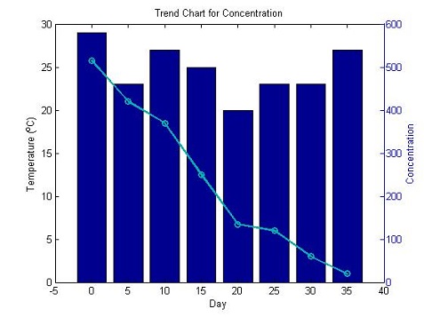
5.7 Overlay line 折线图 + 柱状图
- 适合一个x对应两个函数值
plotyy() 函数
关于
plotyy(X1,Y1,X2,Y2,”function”)中的参数 function,既可以是一个函数句柄,也可以是这些字符串plot,semilogx,semilogy,loglog,stem, 还可以是matlab定义的函数,比如h=function(x,y)。plotyy(x1,y1,x2,y2,function):表示用指定的函数去画图.ployyy(x1,y1,x2,y2,function1,function2):用 function(x1,y1) 画左边的图,用 function2(x2,y2) 画右边的图。
days = 0:5:35;conc = [515,420,370,250,135,120,60,20]temp = [29,23,27,25,20,23,23,27]figure;% plotyy() 函数[hAxes,hBar,hLine] = plotyy(days,temp,days,conc,'bar','plot')% 修改属性set(hLine,'LineWidth',2,'Color',[0,0.7,0.7],'Marker','o')title('Trend Chart for Concentration')xlabel('Day')ylabel(hAxes(1),'Temperature (^{o}C)')ylabel(hAxes(2),'Concentration')
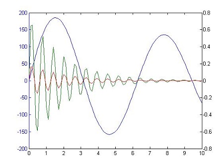
- 还可以利用y轴画多条线
x = linspace(0,10);y1 = 200*exp(-0.05*x).*sin(x);y2 = 0.8*exp(-0.5*x).*sin(10*x);y3 = 0.2*exp(-0.5*x).*sin(10*x);figure[hAx,hLine1,hLine2] = plotyy(x,y1,[x',x'],[y2',y3']);//用左边的y轴画一组数据,用右边的y轴画两组数据
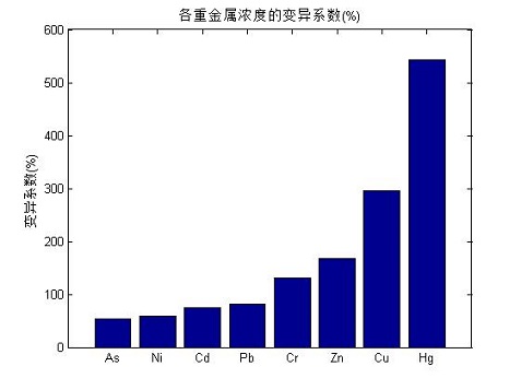
5.8 自定义横坐标
sort()函数,对输入的向量进行排序显示xticklabel可以更改自定义的横坐标,x改成y就是自定义纵坐标
clc,clearx = [53;74;131;296;543;58;81;168];% As Cd Cr Cu Hg Ni Pb Zny = sort(x);bar(y);title('各重金属浓度的变异系数(%)');%xlabel('x轴');ylabel('变异系数(%)');set(gca,'xticklabel',{'As','Ni','Cd','Pb','Cr','Zn','Cu','Hg'});
5.9 修改柱状图的基线
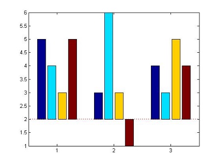
- 可以修改baseline,然后使整个柱状图有上下两个部分,显得更加直观
% 正常的柱状图Y = [5,4,3,5;3,6,3,1;4,3,5,4];figurehBars = bar(Y);% 修改baseline,会变成上下两部分set(hBars(1),'BaseValue',2)% 修改baseline线条的属性hBaseline = get(hBars(1),'Baseline');set(hBaseline,'LineStyle',':','Color','red','LineWidth',2);
6.横向柱状图
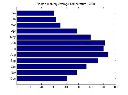
6.1 barh() 函数
- 用于制作横向柱状图,其用法和bar函数类似,所以更多的样式参考 5 垂直柱状图
% Create the data for the temperatures and monthstemperatures = [40.5 48.3 56.2 65.3 73.9 69.9 71.1 59.5 48.7 35.3 31.7 30.0];months = {'Dec', 'Nov', 'Oct', 'Sep', 'Aug', 'Jul', 'Jun', 'May', 'Apr', 'Mar', 'Feb', 'Jan'};% Plot the temperatures on a horizontal bar chartfigurebarh(temperatures)% Set the axis limitsaxis([0 80 0 13])% Add a titletitle('Boston Monthly Average Temperature - 2001')% Change the Y axis tick labels to use the monthsset(gca, 'YTick', 1:12)set(gca, 'YTickLabel', months)
7. 扇形图
- matlab的内置真的没法看,甚至还不如excel,但是excel的画图步骤比较繁琐,这里推荐一个更好的网站:
8. 双坐标画图
- 这里用到了
plotyy()函数,可以参考 5.7
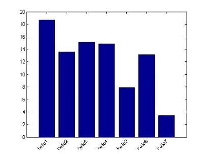
9. 倾斜横坐标标签
y = rand(7,1)*20bar(y);% 将横坐标(xticklabel)标签设置成你想要显示的字符。% 如果是纵坐标改yticklabel,二者都用自然也可以set(gca,'xticklabel',{'hello1','hello2','hello3','hello4','hello5','hello6','hello7'})xtb = get(gca,'XTickLabel'); % 获取横坐标轴标签句柄xt = get(gca,'XTick'); % 获取横坐标轴刻度句柄yt = get(gca,'YTick'); % 获取纵坐标轴刻度句柄xtextp=xt; %每个标签放置位置的横坐标,这个自然应该和原来的一样了。% 设置显示标签的位置,写法不唯一,这里其实是在为每个标签找放置位置的纵坐标ytextp=yt(1)*ones(1,length(xt));% rotation,正的旋转角度代表逆时针旋转,旋转轴可以由HorizontalAlignment属性来设定,% 有3个属性值:left,right,center,这里可以改这三个值,以及rotation后的角度,这里写的是45% 不同的角度对应不同的旋转位置了,依自己的需求而定了。% ytextp - 0.5是让标签稍微下一移一点,显得不那么紧凑text(xtextp,ytextp-0.5,xtb,'HorizontalAlignment','right','rotation',45,'fontsize',10);set(gca,'xticklabel','');% 将原有的标签隐去