@mdjsjdq
2015-09-24T08:51:48.000000Z
字数 9927
阅读 3559
Web Design
编程 设计
Introduction
If you're paying attention to what's going on in the design world, you've probably noticed the ongoing debate around skeuomorphism vs flat design.
So here's a quick test. Which of these two calculators feature a skeuomorphic design?
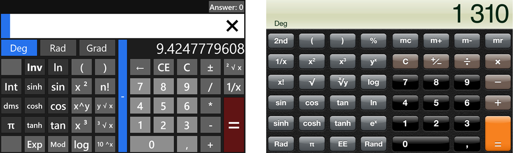
Which of these two apps is skeuomorphic?
If you answered "skeuowhat?" you obviously haven't read any of the approximately 5000 blog posts covering the topic that have come out in recent months, so here's your chance to catch up.
But if you answered "the app on the right, of course!" then I'm sorry to say you got it wrong too! You see, this was a trick question.
The correct answer is that both apps are skeuomorphs. Read on to find out why.
The Skeuomorphism

Find My Friends: the poster boy for gaudy textures(stitched leather textures)

Realism in early OS X versions meant glass everywhere
First of all, you can't ignore the visual appeal of realism: sure, those leather textures and page turn animations feel tacky now after we've been stuck with them for the past couple years, but when the iPhone was first revealed nobody had seen such visual richness in an operating system’s user interface before (let alone on a phone).
A medium's technical constraints will always influence the art it can produce, and this is as true for smartphones as it is for oil painting. Indeed, there are some specific practical factors that made realism work on the iPhone.
For starters, on a smartphone –unlike on a desktop computer– apps take up the entirety of the screen. You never display two apps next to one another, which means you can have two apps with very different visual styles without risking incoherence.

Settings and Weather: same platform, same maker, yet completely different styles.
First of all, realism done wrong can morph into kitsch. After all, even in real life fake leather and fake wood are not exactly considered the pinacle of good taste, so why would things be any different on our screens?
There's also the problem of getting skeuomorphism wrong: making something look like a physical object, but not work like it, also known as the "uncanny valley" of user interface design

Apple's Contacts app for iPad looks like a notebook, yet doesn't let you swipe the pages to browse through your contacts.

Calculator, Calcbot, and Soulver: three different takes on the calculator. Note how for the sake of realism, Apple even uses the traditional "C" key for clearing instead of more understandable backspace symbol like Calcbot.
Another good example is Apple's own calculator app for iOS: by aping a real, physical calculator Apple is artificially recreating physical calculators' limitations in the digital space: single-line screen,limited number of buttons, etc.
By contrast, Calcbot does a much better job of shedding those
limitations by including a history feature that real calculators
obviously lack.And Mac app Soulver goes one step further by shedding the calculator metaphor entirely and instead embracing its platform.

hese UI elements look gorgeous, but they also carry an implicit legacy of physical limitations (Braun UI by Adrien Olczak).
Or take the humble light switch: these are often used in realist UIs, but unlike radio buttons or dropdowns they condition our mind to see the choice as a purely binary one, even when three options might be more appropriate.
When done right, skeuomorphism and realism will trigger strong associations with real-world counterparts. This is both a strength and a weakness: sometimes, the association can be so strong that it will stop you from improving on what's already been done.
The Rise of Flat Design
Whole industries have sprouted around predicting design trends in various fields. Still, nobody expected the next design movement to be spurred by Microsoft.
Whether to better differentiate themselves from Apple or because they genuinely thought this was a better design philosophy, Microsoft embraced a completely different aesthetic for their Metro-style user interface.
Gone were the shadows, highlights, gradients, and textures of iOS apps. Instead, Metro offered flat squares of color with big typography.
Flat design had been around for a long time (you can trace its roots back to Swiss design), but Microsoft certainly sent a strong signal by using it so prominently.
Whether or not the general public cares for big block of flat colors, Microsoft's new design philosophy certainly seemed to strike a chord within the tech sphere, with many praising Metro's strong focus on typography and colors.
And while flat design is often purely visual, it does resonate with designer's love of minimalist concepts, embodied by the famous Antoine de Saint-Exupery that “perfection is achieved not when there is nothing left to add, but when there is nothing left to take away”.
Even game UIs —traditionally a bastion of detailed textures and elaborate shadows— are showing signs of embracing minimalism.
Two of the most talked-about games in recent month, Letterpress and Hundreds both feature flat designs. In fact, Letterpress creator Loren Brichter even revealed that the whole game only uses a single image!
The Influence of Typography
But Metro is only half of the story. While Microsoft was working on Metro, over on the Apple side a big innovation was also taking place: high-definition (or "retina") screens were being introduced, first on the iPhone, then on the iPad and laptops.
For the first time ever, computer displays were approaching the quality of printed paper.
A few years earlier, the adoption of web-ready font formats such as EOT and WOFF by browsers had paved the way to using any font on the web, and many foundries had started the long and arduous process of optimizing their catalog for onscreen use.
But high-dpi screens make it possible to use even faces that haven't been optimized for screen use, as Erik Spiekermann tweeted:
If you want good type on Retina displays, stop discussing hinting et al. Just search for faces that happen to look good. Like the old days.
Or, as John Gruber put it in his article on the topic :
The trend away from skeuomorphic special effects in UI design is the beginning of the retina-resolution design era.
When you have a high-definition display and screen-optimized fonts, you quickly realize you don't need much else to create beautiful work.
The Responsive Web
The mobile web's influence on design was felt in yet one more way: responsive design.
Responsive (or adaptive) design is the idea that instead of creating multiple designs for different devices, a single design should adapt to multiple screens.
This can take the form of a multi-column desktop grid morphing into a single-column layout, big fonts getting smaller, or hover-activated menus responding to taps on a phone.

The Next Web's recent redesign is both flat and responsive.
All this resizing and shape-shifting makes it very hard to use fixed-size assets. Instead, designers found it much more efficient to rely on CSS-generated graphics rendered by the browser.
Moreover, traditional design programs such as Photoshop don't have an answer for responsive design yet, which is pushing many designers towards prototyping in the browser directly, foregoing static mockups entirely.
Add all this together and you begin to see why many designers are moving away from texture-heavy realism towards the more flexible and lighter-weight flat style.
The Limits of Flat
This is not to say that the flat style is without its own problems.
First of all, like any design trend, it will probably be abused by many designers jumping on the bandwagon without thinking their design choices through.
But where the main victim of realism is merely good taste, taking minimalism too far can have serious consequences on usability
Users have come to rely on a lot of subtle clues to make their way through an interface: buttons have slight gradients and rounded corners, form fields have a soft inner shadow, and navigation bars "float" over the rest of the content.
Remove all these clues, and you end up with a flat world where every element is suddenly placed at the same level, potentially leading to confusion: Is this a button, or simply a banner? Will anything happen if I tap this?
As designers, will we be able to resist the appeal of minimalism and keep in mind that the needs of users should always come before our aesthetic pursuits? If the way we handled the previous realism trend is any indication, users might be in for a rough ride…
So it bears repeating that visual style is nothing more than a means to an end. If the situation calls for realism, go nuts on textures and highlights. On the other hand, if a flat aesthetic achieves the design's goal better then it might be time to go on a gradient diet.
Knowing which style is appropriate for which project can only come with experience, as well as lots of experimentation
An Unexpected Contender
One of the main reason why the "realism vs flat design" debate gained so much steam in recent months is surely that it maps neatly to the "Apple vs Microsoft" narrative.
So it came as a surprise when Google renewed its focus on design and proved itself a serious contender.
With the recent releases of their newer mobile apps, Google has started pushing a style that some describe as "almost flat", or maybe "skeuominimalism". Unlike the drastic visual wastelands of Gmail or Google Reader, this new style uses elements like shadows and gradients in a tasteful, subtle way.
This style offers the best of both world: realism's affordances and subtle hints combined with the purity and simplicity off flat design.
But another way to look at it is that it's simply design done right: seeking efficiency and simplicity without sacrificing usability to the altar of minimalism.
In other words, Google is not so much pioneering a new style as showing us what digital design looks like when it's done right (…and by the same occasion, how much we all still suck at it!).
The Way Forward
And what do I think about all this?
I'm glad you asked. Of course, I think it's important to keep in mind that visual styles are just tools, and not goals in themselves. But this is (I hope) a fairly obvious point, and one that many designers have made before me
So instead, I will pick a camp and put my chips in with flat design (specifically, Google's less-extreme variety). But not for the reasons you might think.
It's not that I think that flat design is inherently superior, or that I have a minimalism fetish. After all, I love a gorgeously textured iOS app just as much as anybody.
I just feel like designers have had a lot of practice crafting realistic things. Browse Dribbble for a few minutes and you'll come across dozens of intricate, drool-worthy 3D renders or Photoshop mockups.
What we haven't had as much practice at yet is designing flexible, beautifully typeset responsive sites that adapt to various resolutions and environments. And we've gotten even less practice at actually coding them.
I believe that until our tools catch up with what the web has to offer, we'll have to get our hands dirty and start coding. And when you're both designing and coding a layout, you start to appreciate the value of keeping things lightweight.
Flat design also forces you to really care about typography and layout, two areas where web design has traditionally lagged behind its more established print cousin.
And on the mobile side, flat design can make it easier to focus on animation and interaction design, as apps like Letterpress and Clear have shown us.
So this is why I've been embracing flat design lately: not just as an aesthetic choice, but as a design exercise that forces me to shore up my weaknesses.
