@Wangww0925
2019-08-07T03:24:52.000000Z
字数 852
阅读 283
六位密码输入框
插件
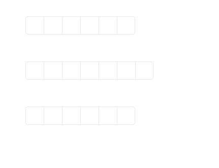
效果图
demo下载
使用文档
options 可用参数说明
container - 容器:'#box' | '.box'等focusStyle - 选中样式,默认ff8200【可在css中修改】len - input的个数,默认6valText - 显示的内容,默认*style - 显示input样式【整体样式可在css中修改】- fontSize - 默认24px- width - 默认36px- height - 默认36px- paddingTop - 默认0px- ... - 根据自身需求增加
options 内回调函数
blurFun - 失去焦点回调inputFun - 监听数据变化回调callback - getEevent 逻辑处理函数回调【该函数中使用 focus、blur、input, 如要另外增加内容可写在该回调中】
使用步骤
1、 引入 pwdInput.css2、 引入 pwdInput.js3、 调用 new pwdInput('#box')
例子:
<!DOCTYPE html><html lang="en"><head><meta charset="UTF-8"><title>Document</title><style>body > div{width: 500px;margin: 50px auto;}</style><link rel="stylesheet" href="pwdInput.css"></head><body><div id="box"></div><script src="pwdInput.js"></script><script>// 使用new pwdInput('#box',{len: 7,valText: "·",style:{paddingTop: '5px'},callback: function (){console.log("事件处理的回调")}})</script></body></html>
作者 wendy
2019 年 1月 22日
