@agpwhy
2021-05-18T07:04:32.000000Z
字数 3914
阅读 442
王胖的生信笔记6:继续大搞ggplot2
关于坐标轴
首先复习一下上一期完成的内容
library(ggplot2)
chic <- readr::read_csv("https://raw.githubusercontent.com/Z3tt/R-Tutorials/master/ggplot2/chicago-nmmaps.csv")
tibble::glimpse(chic)
g <- ggplot(chic, aes(x = date, y = temp))
g + geom_line() + geom_point()
g + geom_point(color = "#C1D8F7",
shape = "diamond",
size = 2) + geom_line(color = "firebrick",
linetype = "dotted",
size = .3)
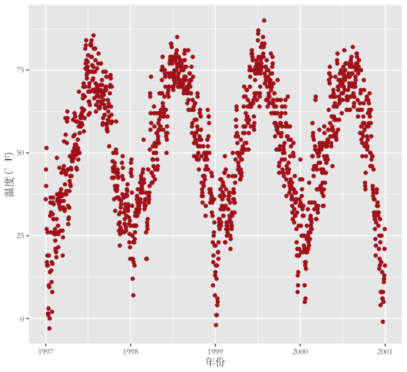
theme_set(theme_bw())
g + geom_point(color = "#C1D8F7")
修改中文
这样的图感觉坐标轴下的标注不够精准,比如我们可以把中文写进坐标轴标注(关于如何在ggplot2里显示中文,需要你先找一下你的字体库,比如我想用宋体,不能直接在base_family里面写宋体,需要写“STSong”,需要知道你字体库中的具体名称。如果有超过两个人问,我写一下怎么找字体名称。)
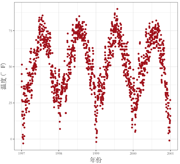
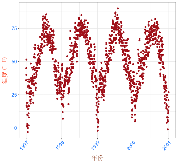
ggplot(chic, aes(x = date, y = temp)) + geom_point(color = "firebrick") + labs(x = "年份", y = "温度 (°F)") + theme_grey(base_family = "STSong")
或者这么写
ggplot(chic, aes(x = date, y = temp)) + geom_point(color = "firebrick") + labs(x = "年份", y = expression(paste("温度 (", degree ~ F, ")" ^ "(我来小调皮一下)"))) + theme_grey(base_family = "STSong")
【你发现了什么异同了嘛?】
调节坐标轴标注
对于坐标轴还有很多可以调节的地方,比如调节标注大小(size),标注于坐标轴间隔(vjust即调节垂直方向上的间隔)
ggplot(chic, aes(x = date, y = temp)) + geom_point(color = "firebrick") + labs(x = "年份", y = "温度 (°F)") + theme( axis.title.x = element_text(vjust = 0, size = 15), axis.title.y = element_text(vjust = 2, size = 15), text = element_text(family = "STSong") )
(注意看这里y轴调节间隔用的vjust,是相对于y轴的垂直距离,即平行于x轴的间隔)
调节间隔也可以使用这个,其中margin = margin (t=10)就是上方设置10的间隔,r,b,l分别是右,下,左,可以复合写入,比如margin= margin (t=10, r= 20):
ggplot(chic, aes(x = date, y = temp)) + geom_point(color = "firebrick") + labs(x = "年份", y = "温度 (°F)") + theme( axis.title.x = element_text(margin = margin(t = 10), size = 15), axis.title.y = element_text(margin = margin(r = 10), size = 15), text = element_text(family = "STSong") )
可以通过在theme中指定斜体/粗体和颜色【但是无奈的是,中文字体我不知道怎么搞斜体/粗体】
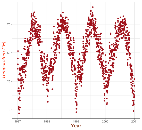
ggplot(chic, aes(x = date, y = temp)) +geom_point(color = "firebrick") + labs(x = "Year", y = "Temperature (°F)") + theme(axis.title = element_text(color = "sienna", size = 15,face = "bold"), axis.title.y = element_text(color = "orangered", size = 15,face = "italic"))
【小问题,怎么指定斜体粗体呢?聪明的你不妨一试】
调节刻度及标注
除了坐标轴的标注,刻度的标注也可以类似调节。还可以指定标注的旋转角度(以坐标轴为参考)
ggplot(chic, aes(x = date, y = temp)) + geom_point(color = "firebrick") + labs(x = "年份", y = "温度 (°F)")+ theme(axis.text = element_text(color = "dodgerblue", size = 12), axis.text.x = element_text(face = "italic",angle = 50, vjust = 1, hjust = 1, size = 12), axis.title = element_text(family = "STSong"), axis.title.x = element_text(margin = margin(t = 10), color = "sienna",size = 15), axis.title.y = element_text(margin = margin(r = 10), color = "orangered",size = 15))
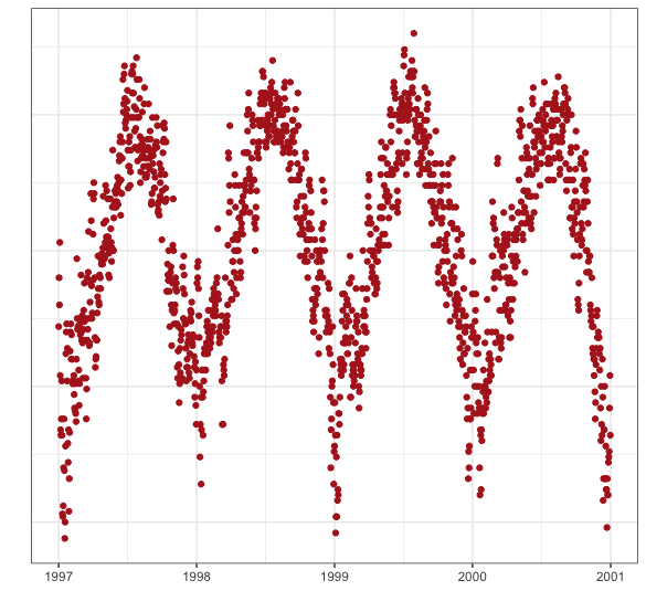
还可以通过在theme里把axix.ticks= element_blank()来消除刻度,axis.text= element_blank()来消除刻度标注。
(也可以通过= NULL 来替代 element_blank() 或者单处用= “ ”来消除文字)
ggplot(chic, aes(x = date, y = temp)) + geom_point(color = "firebrick") + labs(x = NULL, y = "") + theme(axis.ticks.y = element_blank(), axis.text.y = element_blank())
限制画图范围
如果我只想看一部分范围内的数据呢?
茴香豆的茴右四种写法,那其实这也至少有三种写法。
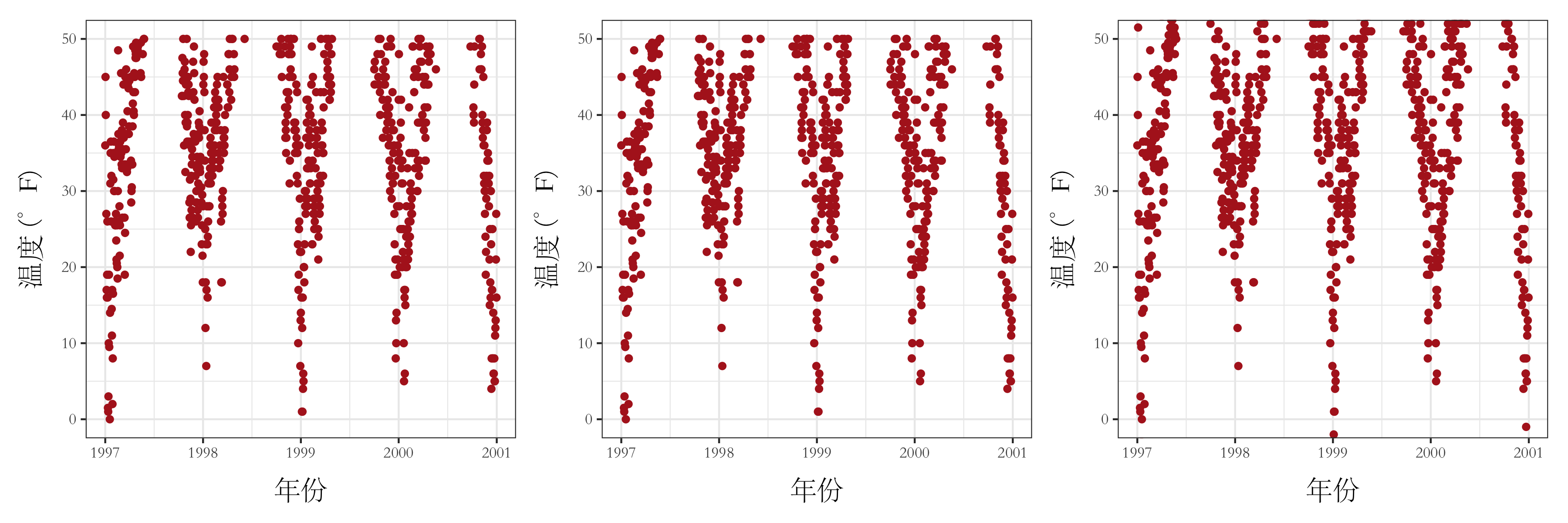
本体都是
ggplot(chic, aes(x = date, y = temp)) + geom_point(color = "firebrick") + labs(x = "年份", y = "温度 (°F)") + theme( axis.title.x = element_text(margin = margin(t = 10), size = 15), axis.title.y = element_text(margin = margin(r = 10), size = 15), text = element_text(family = "STSong") )
区别在于前两个是等价的,用的是+ ylim(c(0, 50))或者+ scale_y_continuous(limits = c(0, 50))。粗暴的把大于50的点删除。最后一个是还是对所有数据做图了,只是展示了部分数据(做图时并没有删除原来的数据)。
同时我有时候想指定一个坐标原点该怎么办呢?
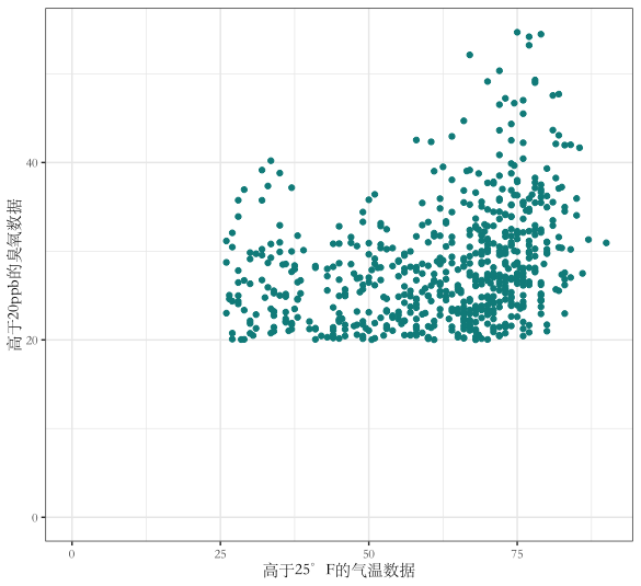
这是用了数据的其他两个参数做了简单的筛选。并且强制以(0,0)作为原点
library(tidyverse)
chic_high <- dplyr::filter(chic, temp > 25, o3 > 20)
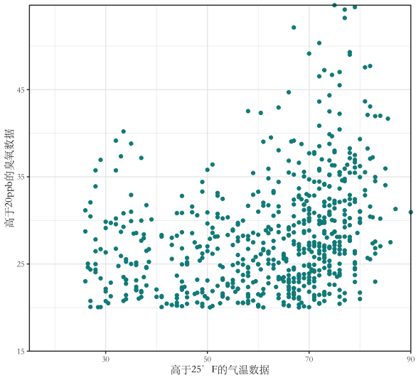
ggplot(chic_high, aes(x = temp, y = o3)) + geom_point(color = "darkcyan") + labs(x = "高于25°F的气温数据", y = "高于20ppb的臭氧数据") + expand_limits(x = 0, y = 0)+ theme(text = element_text(family = "STSong"))
当中强制设定原点的部分expand_limits(x = 0, y = 0) 可以用coord_cartesian(xlim = c(0, NA), ylim = c(0, NA))来替代
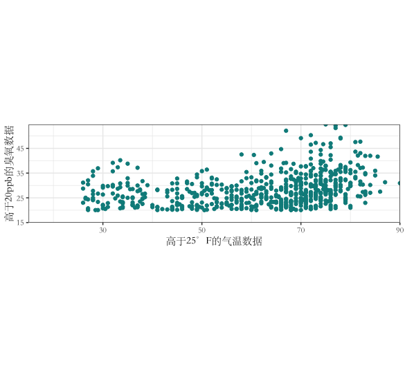
ggplot(chic_high, aes(x = temp, y = o3)) + geom_point(color = "darkcyan") + labs(x = "高于25°F的气温数据", y = "高于20ppb的臭氧数据") + expand_limits(x = 15, y = 15)+ theme(text = element_text(family = "STSong")) + scale_x_continuous(expand = c(0, 0)) + scale_y_continuous(expand = c(0, 0)) + coord_cartesian(clip = "off")
加上coord_cartesian(clip = "off")就是让数据顶格。这次坐标原点设定在了(15,15)
加上coord_fixed (ratio = 1/2)可以设定同样一个单位x轴上和y轴上显示比例。比如这里就是一个x轴单位:一个y轴单位=2:1
拓展内容。会一点R的可以通过一些代码自动变化坐标轴标记。这里涉及到tidyverse的部分知识,有机会再说了。
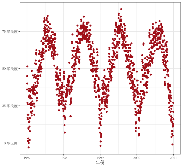
ggplot(chic, aes(x = date, y = temp)) + geom_point(color = "firebrick") + labs(x = "年份", y = NULL) + scale_y_continuous(label = function(x) {return(paste(x, "华氏度"))})+ theme(text = element_text(family = "STSong"))