@agpwhy
2022-05-12T14:03:51.000000Z
字数 1592
阅读 464
王胖的生信笔记第42期-花瓣图
花瓣图是啥
这应该不是一个官方的名称,是看到一个叫做ccgraph的包里讲到的。cc这个词来源于《一个馒头引发的血案》里的圆环套圆环,可以用在很多地方。

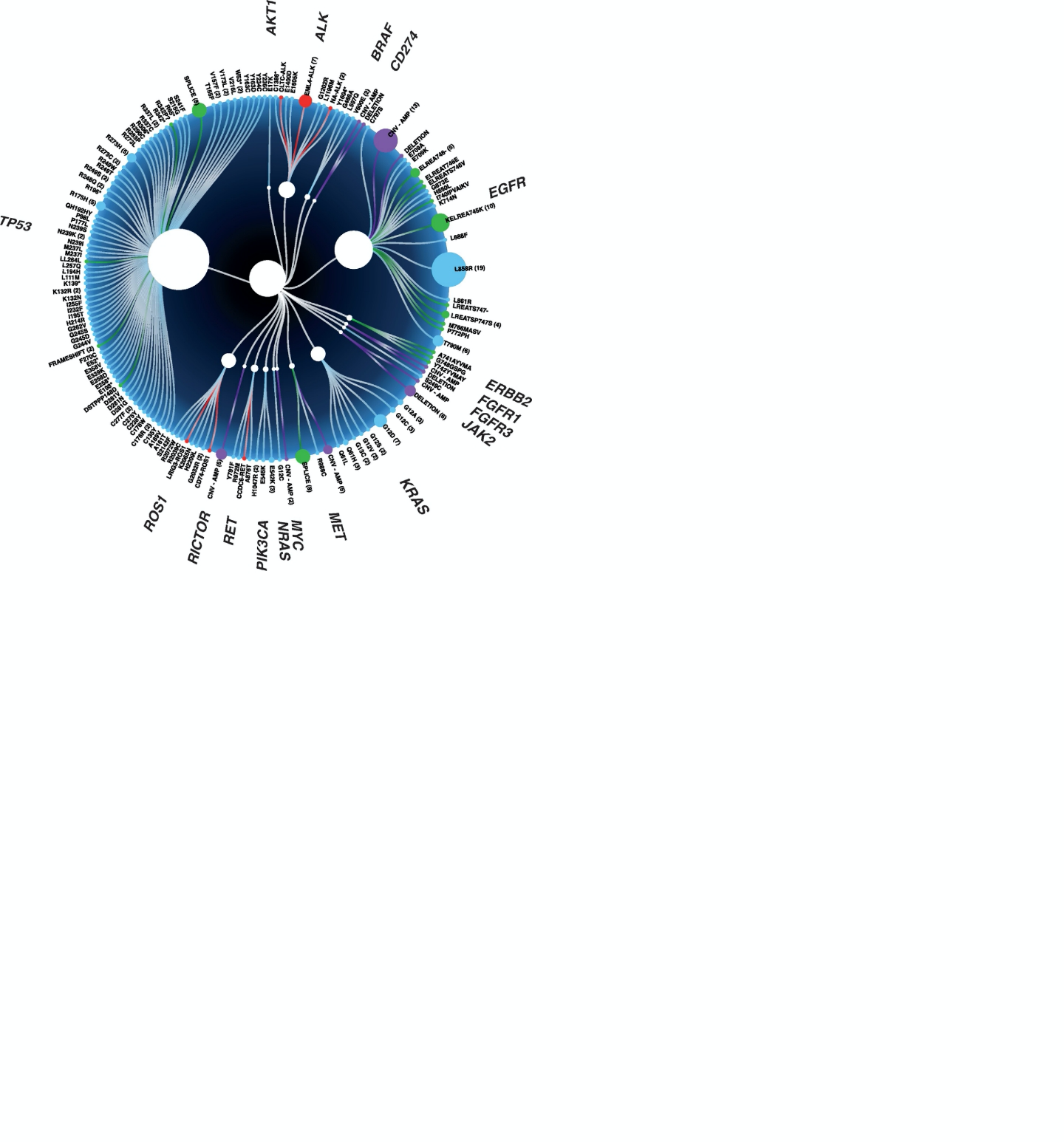
A Prospective Study of Circulating Tumor DNA to Guide Matched Targeted Therapy in Lung Cancers
这篇文章里讲到的用处是内层标明测序在若干基因发现的 SNP/Indel/CNV 等各类突变,外层来展示各类基因。同时点的大小可以表示某参数的大小。
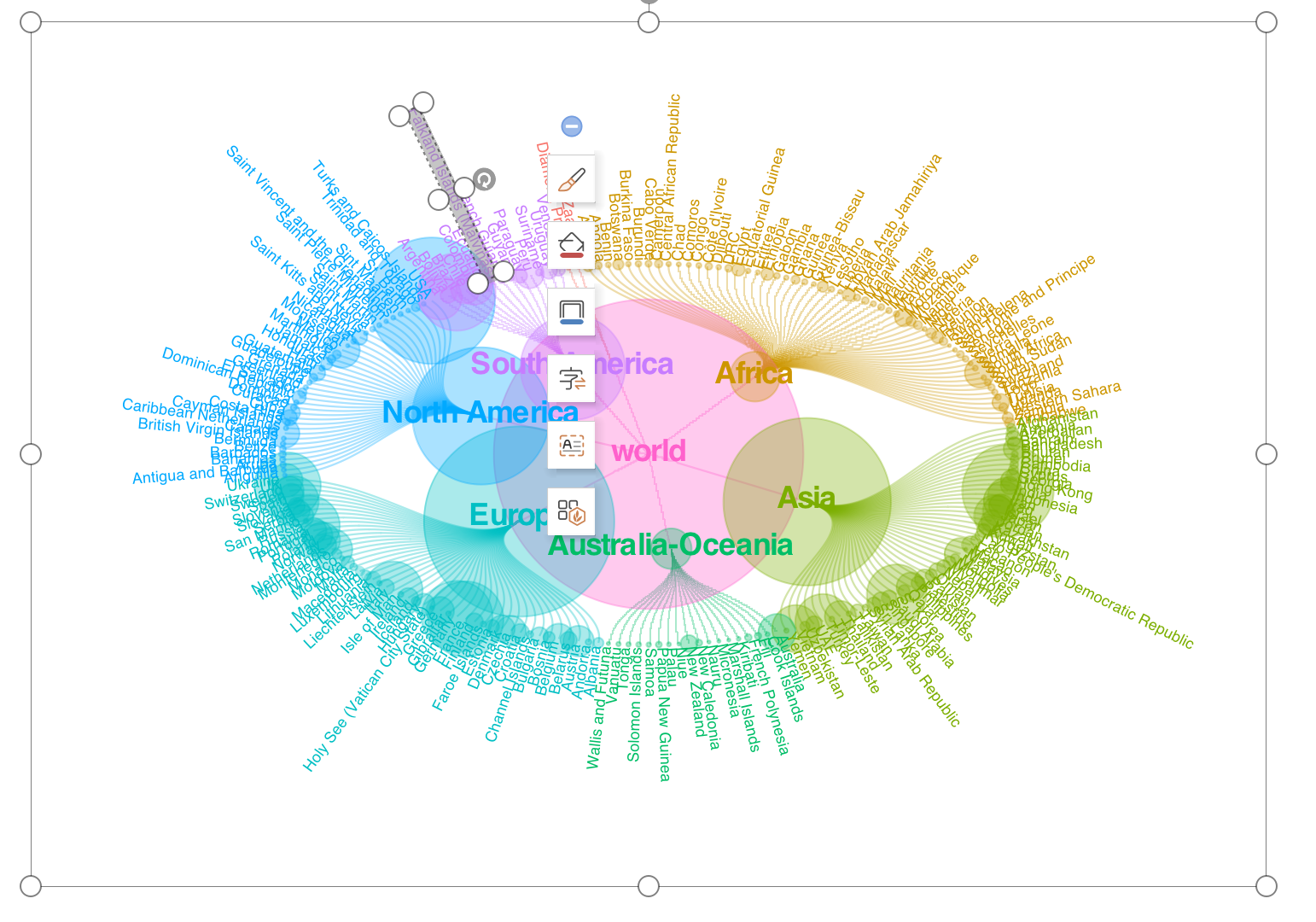
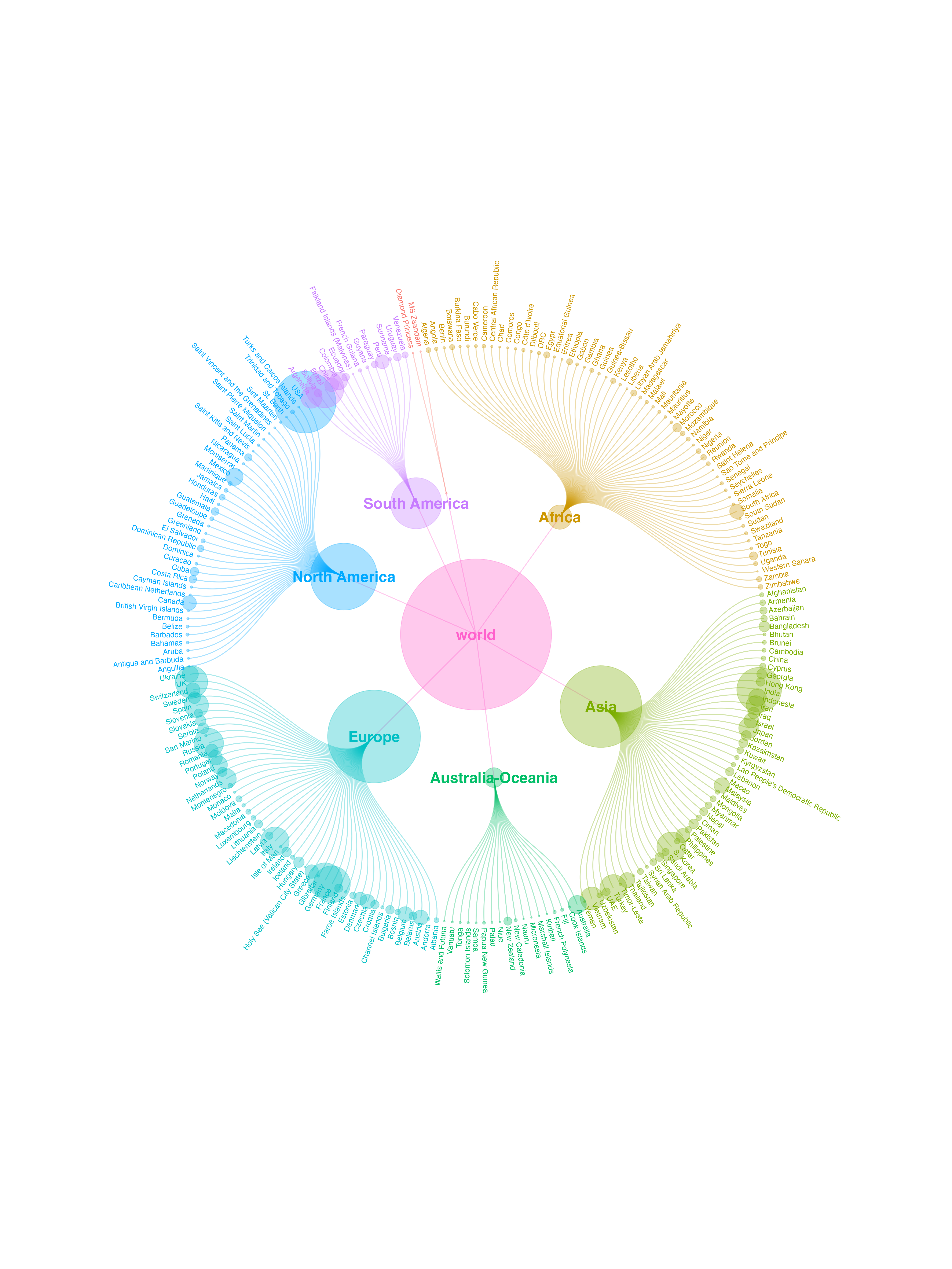
拿新冠数据练练手
ccgraph官方教程是自己生成一个模拟的宏基因组数据,还有一个是2014年的世界经济数据,我们来点真实的。
新冠数据的来源可以使用之前笔记写过的nCov2019这个包。
library(tidyverse)library(ggraph)library(ccgraph)library(nCov2019)library(treemap)library(export)res <- query()dat <- res$latest$detail
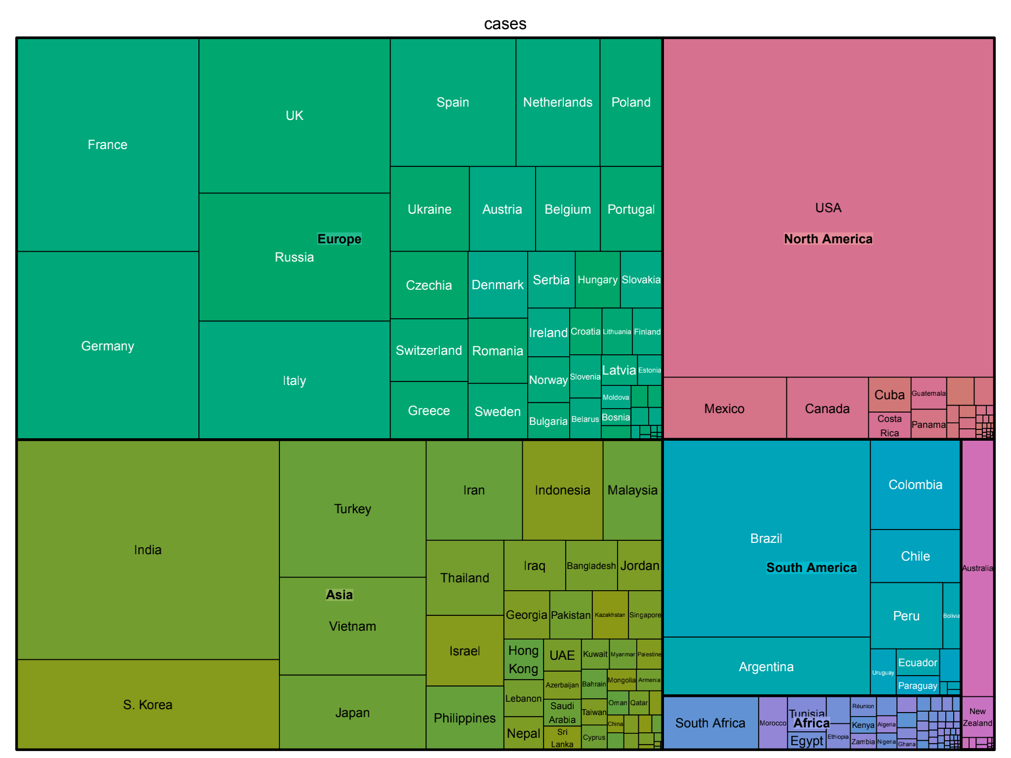
先来看看大概数据情况
treemap(dat,index=c("continent","country"),vSize = "cases")
数据转换
这个包比较好的一个方面,就是把网络图node,edge的设置简单化了。
country_index <- c("continent","country")nodes_country <- gather_graph_node(dat,index = country_index, value = "cases",root="world")edges_country <- gather_graph_edge(dat,index = country_index,root="world")library(tidygraph)
然后再结合node和edge转为ggraph能做图的格式。
graph_country <- tbl_graph(nodes_country,edges_country)gc <- ggraph(graph_country,layout = 'dendrogram', circular = TRUE) +geom_edge_diagonal(aes(color=node1.node.branch),alpha=1/3) + geom_node_point(aes(size=node.size,color=node.branch),alpha=1/3) + coord_fixed() + theme(legend.position = "none")
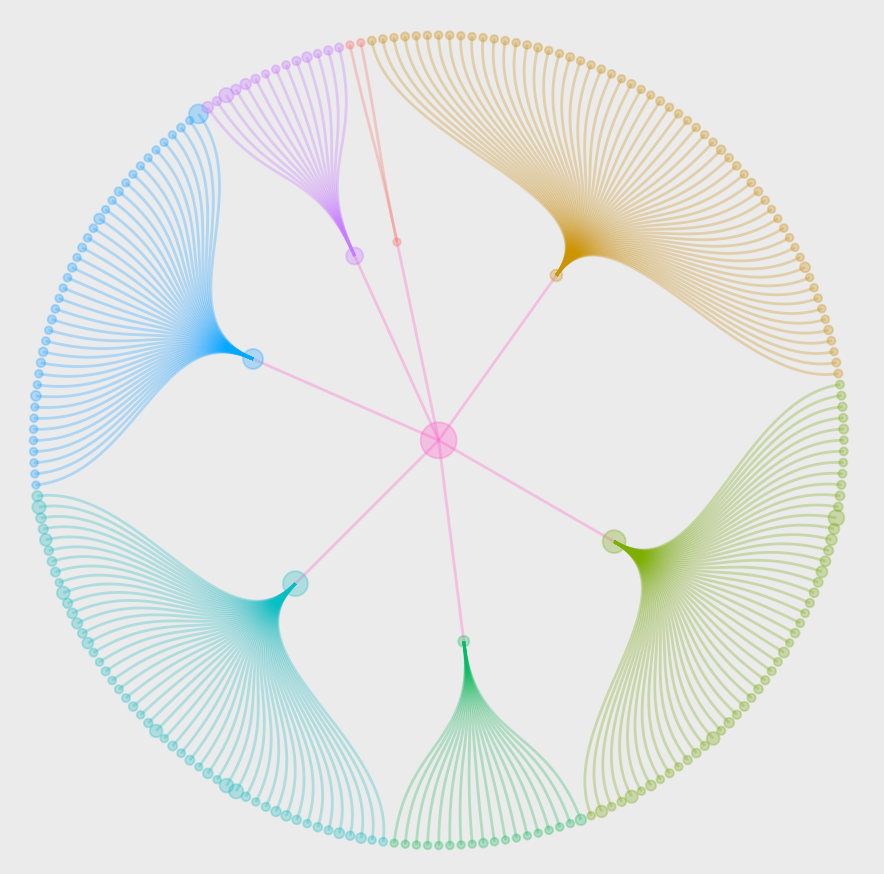
不过这个时候,是没有内外层环的文字的。按照教程添加一下文字,修改一下视觉效果。
gc1 <- gc + scale_size(range = c(0.5, 40)) +geom_node_text(aes(x = 1.0175 * x, #这边前面系数是外层文字环的横径y = 1.0175 * y,#这边前面系数是外层文字环的竖径label = node.short_name,angle = -((-node_angle(x, y) + 90) %% 180) + 90,filter = leaf,color = node.branch),size = 3,hjust = 'outward') +geom_node_text(aes(label = node.short_name,filter = !leaf,color = node.branch),fontface = "bold",size = 6,family = "sans") +theme_void() +theme(legend.position = "none") +coord_cartesian(xlim =c(-1.5, 1.5), ylim = c(-2, 2))
最后展示下效果
还能直接输出成ppt哦,改起来更方便(这个下次再水一个笔记)。