@agpwhy
2021-12-01T09:33:06.000000Z
字数 2797
阅读 387
王胖的生信笔记28期:全球新冠相关流行病学数据
最近正值南非最先上传的Omicron变异在新闻上传播的很火热。大家应该很好奇南非本地的流行病学数据是咋样的。当然可以直接百度,Bing,Google,但是这样看到的数据要看到历史变化是比较繁琐的。有没有比较个性化去挖掘的方法去看呢?
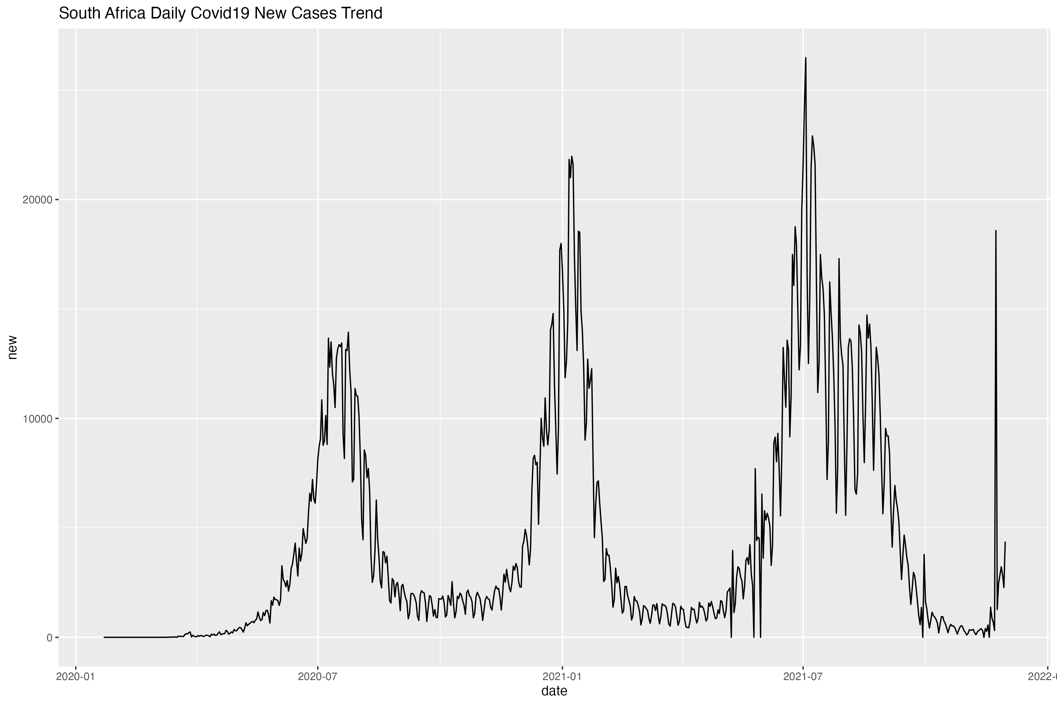
简单来说可以看到,最近南非的每日新增在第三波相对平息后没多久,就有一个一飞冲天的趋势。当然这只是几天内的数据,具体还是要结合实际及更多的数据才能判断Omicron这个变异株的一些流行病学性质。
如何做出这种呢?
这里就要介绍Y叔(南方医科大学余光创教授)团队的一个R包了。
对于爬虫,我只会最基本的一些技能,但没事,Y叔替你包了。
remotes::install_github("YuLab-SMU/nCov2019")
(安装困难的,可以看之前介绍如何安装R包的笔记)
以下就按照Y叔给的教学示范,给大家展示下如何利用好这个包爬来的的这些数据。
教学示例开始
配置运行环境。
library(dplyr)

library(ggplot2)

library(shadowtext)

library(nCov2019)
res <- query()
这里的res就是爬到的全球流行病学数据了。
y <- res$historical
d <- y["global"]
time = as.Date("2021-11-30")
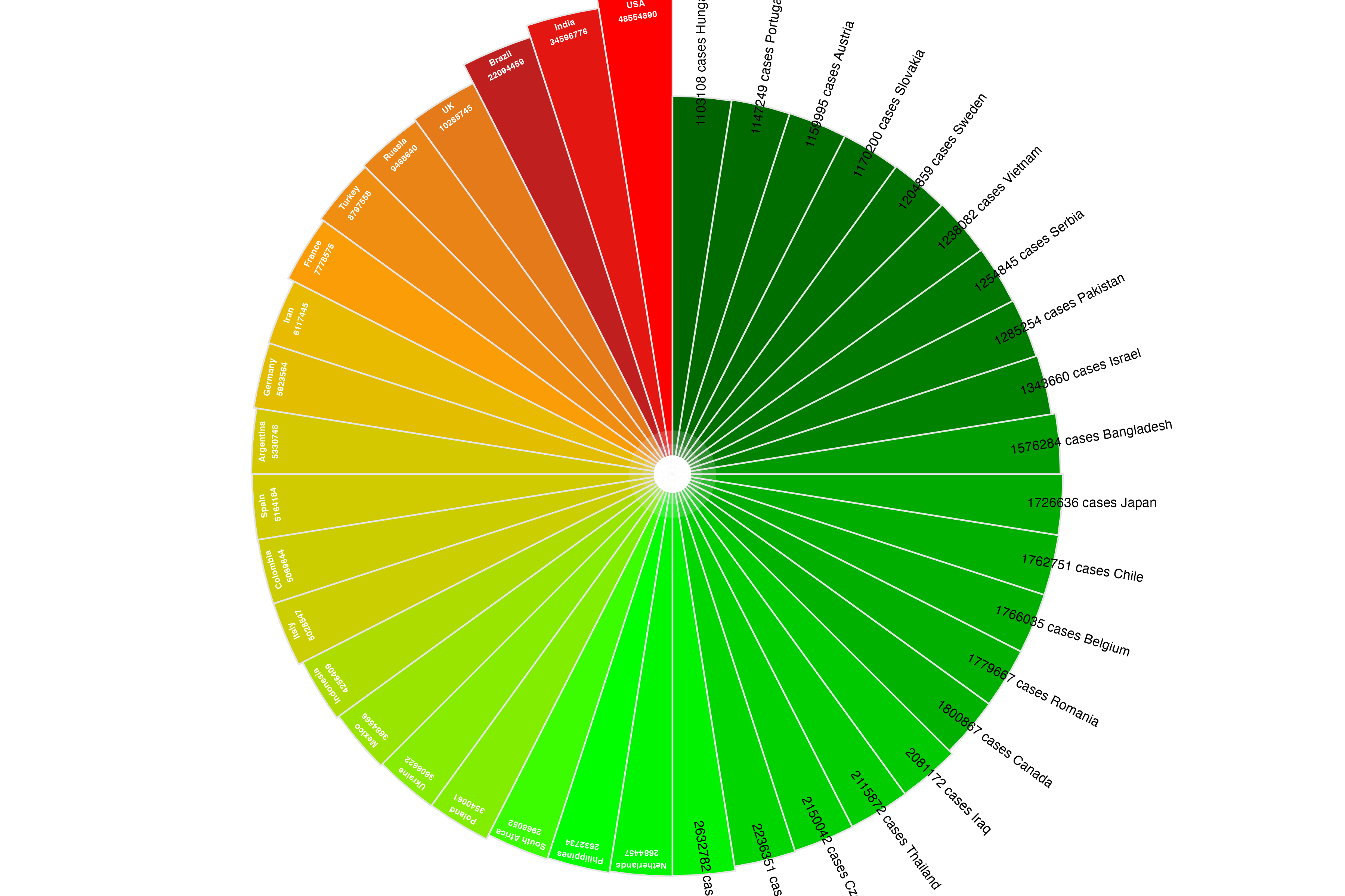
dd <- filter(d, date == time) %>% arrange(desc(cases))
选取部分我们需要的数据,这里是选取全球截止11-30的数据,并且按照绝对病例数排序。
dd = dd[1:40, ]
dd$country = factor(dd$country, levels=dd$country)
选取前40位(大约是所有超过100w确诊的国家或地区)
k = median(dd$cases)
中位数涉及到后续作图,超过中位数的地区名可以画在柱状图里,低于的可以画在柱状图外。
dd$angle = 1:40 * 360/40
依旧是作图需要的角度。
p <- ggplot(dd, aes(country, cases, fill=cases)) + geom_col(width=1, color='grey90') + geom_col(aes(y=I(5)), width=1, fill='grey90', alpha = .2) + geom_col(aes(y=I(3)), width=1, fill='grey90', alpha = .2) + geom_col(aes(y=I(2)), width=1, fill = "white") + scale_y_log10() + scale_fill_gradientn(colors=c("darkgreen", "green", "orange", "firebrick","red"), trans="log") + geom_text(aes(label=paste(country, cases, sep="\n"), y = cases *.8, angle=angle), data=function(d) d[d$cases > k,], size=2, color = "white", fontface="bold", vjust=1) + geom_text(aes(label=paste0(cases, " cases ", country), y = max(cases) * 2, angle=angle+90), data=function(d) d[d$cases < k,], size=3, vjust=0) + coord_polar(direction=-1) + theme_void() + theme(legend.position="none") + ggtitle("COVID19 global trend", time)
(这里需要对与ggplot2的说明书反复观看,可以看之前的系列笔记。也需要一些R的基本知识。)
另一张图
y <- res$historical
d <- y["global"]
dd <- d %>% as_tibble %>% filter(cases > 1000000) %>% group_by(country) %>% mutate(days_since_1m = as.numeric(date - min(date))) %>% ungroup
这里是超过100w确诊的国家获得增长的趋势。
breaks=c(1000, 10000, 20000, 50000, 500000,500000,5000000,20000000)
改变一下y轴的比例,否则做出来不好看了(哪怕在确诊过百万的国家中,某些数据遥遥领先导致线飘的太高)。
p2 <- ggplot(dd, aes(days_since_1m, cases, color = country)) + geom_smooth(method='lm', aes(group=1), data = dd, color='grey10', linetype='dashed') + geom_line(size = 0.8) + geom_point(pch = 21, size = 1) + scale_y_log10(expand = expansion(add = c(0,0.1)), breaks = breaks, labels = breaks) + scale_x_continuous(expand = expansion(add = c(0,1))) + theme_minimal(base_size = 14) + theme( panel.grid.minor = element_blank(), legend.position = "none", plot.margin = margin(3,15,3,3,"mm") ) + coord_cartesian(clip = "off") + geom_shadowtext(aes(label = paste0(" ",country)),hjust=0, vjust = 0, data = . %>% group_by(country) %>% top_n(1,days_since_1m), bg.color = "white") + labs(x = "Number of days since 1,000,000th case", y = "", subtitle = "Total number of cases")
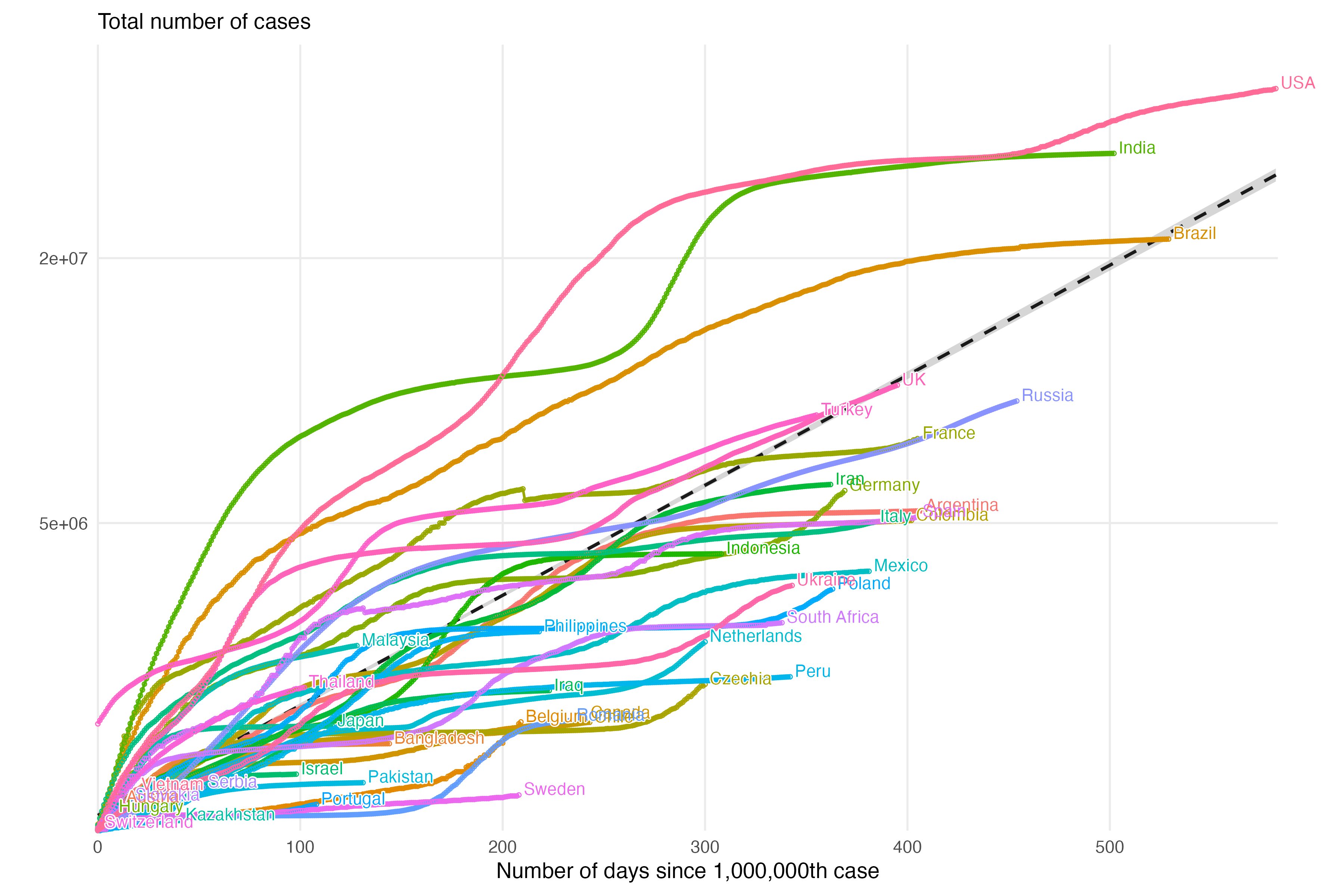
文章开始的那张图
类似的
res$historical["South Africa"] -> y
ggplot(y, aes(date, cases)) + geom_line()
y$new = y$cases - c(0, y$cases[1:nrow(y)-1])
ggplot(y, aes(date, new)) + geom_line() + ggtitle("South Africa Daily Covid19 New Cases Trend")
当然我参考资料画出来的就没这么好看啦。
感兴趣的也可以看看其他国家或地区的啦。
