@agpwhy
2021-09-02T08:09:27.000000Z
字数 2709
阅读 406
王胖的生信笔记第18期:滤波+平滑
经常大家看到有些图片上是带范围的,不是单独一条线,可能是置信区间或者AUC这种。
这一期之后可能要暂时鸽一下了。9月底我们再见。
线性滤波
首先熟悉一下这个函数。stats::filter。这是一个可以进行滤波功能的函数。
为了了解一下它的功能,简单看一下如下的结果。
x <- 1:100 这是表示已1, 2, 3, ... 100这样的数列为例。
stats::filter(x, rep(1/3, 3)) 的结果如下
NA 2 3 4 5 6 7 8 9 10 11 12 13 14 15 16 17 18 19 20 21 22 23 24 25 26 27 28 29 30 31 32 33 34
35 36 37 38 39 40 41 42 43 44 45 46 47 48 49 50 51 52 53 54 55 56 57 58 59 60 61 62 63 64 65 66 67 68
69 70 71 72 73 74 75 76 77 78 79 80 81 82 83 84 85 86 87 88 89 90 91 92 93 94 95 96 97 98 99 NA
发现规律了吗?就是将自身和前后两个数各作为1/3的权重,重新计算。由于这个数列太平滑,看不出滤波的效果。
就还是回到我们的数据上来。
chic$o3run <- as.numeric(stats::filter(chic$o3, rep(1/30, 30), sides = 2))
ggplot(chic, aes(x = date, y = o3run)) + geom_line(color = "chocolate") + labs(x = "Year", y = "Ozone after filter")
ggplot(chic, aes(x = date, y = o3)) + geom_line(color = "blue") + labs(x = "Year", y = "Ozone")
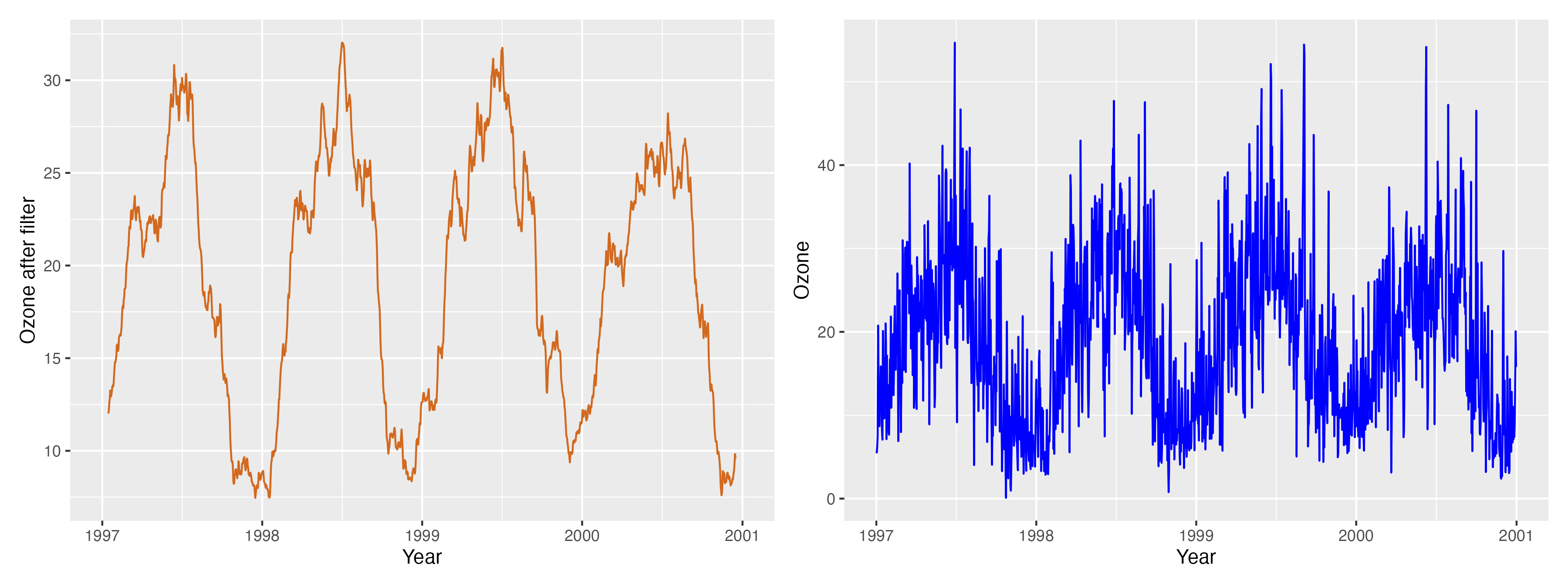
这样就可以看到滤波(左边是滤波完的)的作用了
AUC和加上线条区间
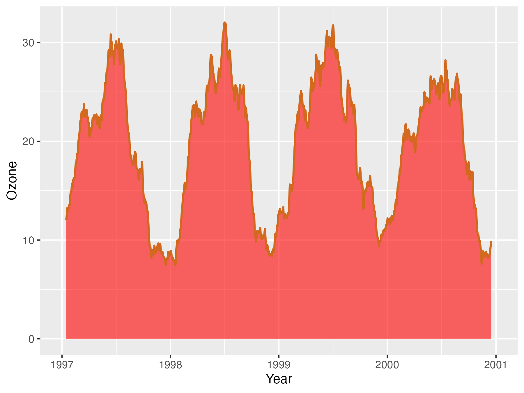
有了线条后,最直白的加上AUC的方式就是这样
ggplot(chic, aes(x = date, y = o3run)) + geom_ribbon(aes(ymin = 0, ymax = o3run), fill = "red", alpha = .6) + geom_line(color = "chocolate", lwd = .8) + labs(x = "Year", y = "Ozone")
或者geom_area()。里面的lwd是线条的宽度
ggplot(chic, aes(x = date, y = o3run)) + geom_area(color = "chocolate", lwd = .8, fill = "red", alpha = .6) + labs(x = "Year", y = "Ozone")
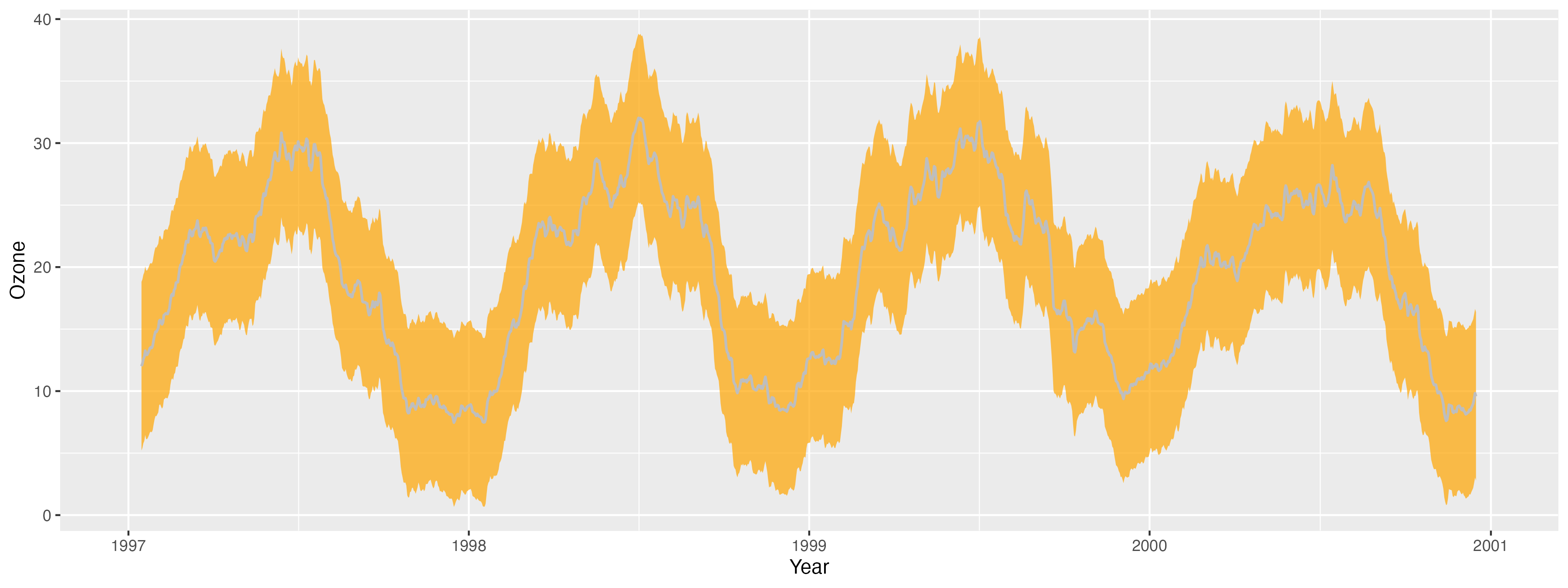
如果要加上上下一个标准差的置信区间。先算一下每个点上下一个标准差的值。
chic$down <- chic$o3run - sd(chic$o3run, na.rm = TRUE)
chic$up <- chic$o3run + sd(chic$o3run, na.rm = TRUE)
再使用一下geom_ribbon(),就可了。
ggplot(chic, aes(x = date, y = o3run)) + geom_ribbon(aes(ymin = down, ymax = up), alpha = .7, fill = "orange", color = "transparent") + geom_line(color = "gray", lwd = .7) + labs(x = "Year", y = "Ozone")
另外平滑的方式
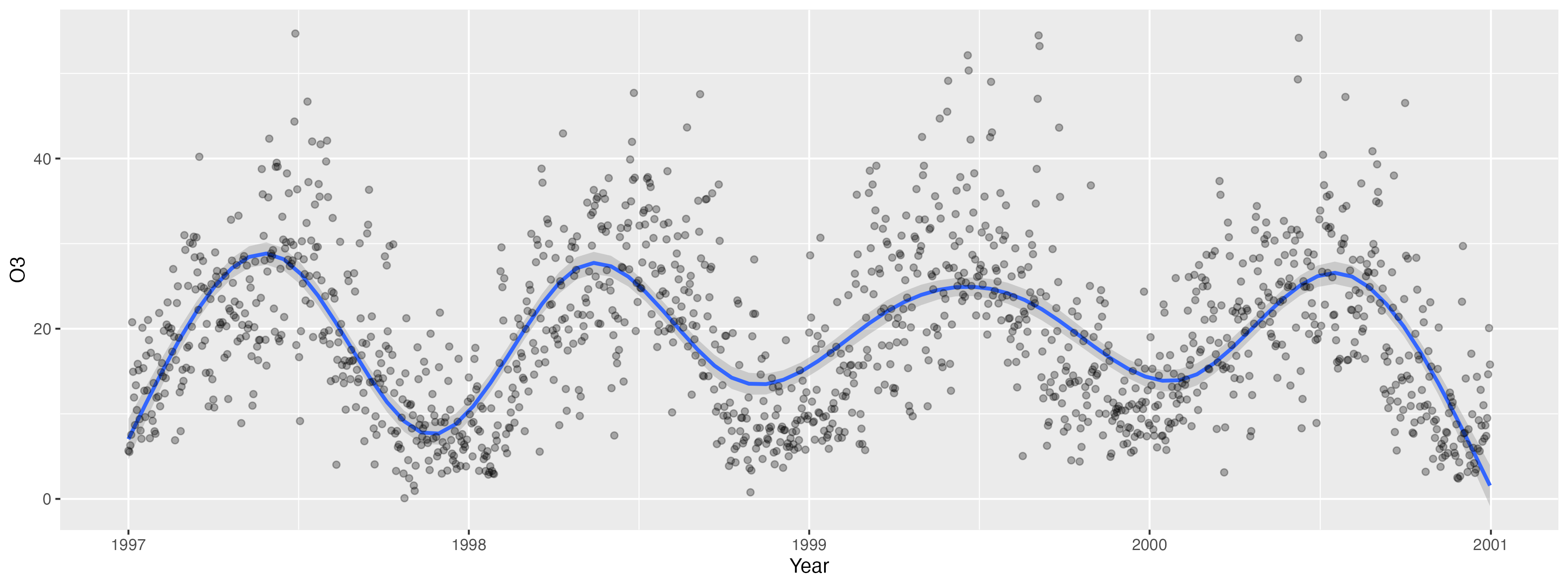
如果觉得使用线性滤波那个太复杂,想同时展示原始的点加平滑后的线,其实还有一个很好的方式。
这后面平滑的原理比较复杂,我也不太懂,用的是locally weighted scatter plot smoothing(小于一万个数值)或者generalized additive model(大于一万个数值)。总之就是很好用。
ggplot(chic, aes(x = date, y = o3)) + labs(x = "Year", y = "o3") + stat_smooth() + geom_point(color = "black", alpha = .3)
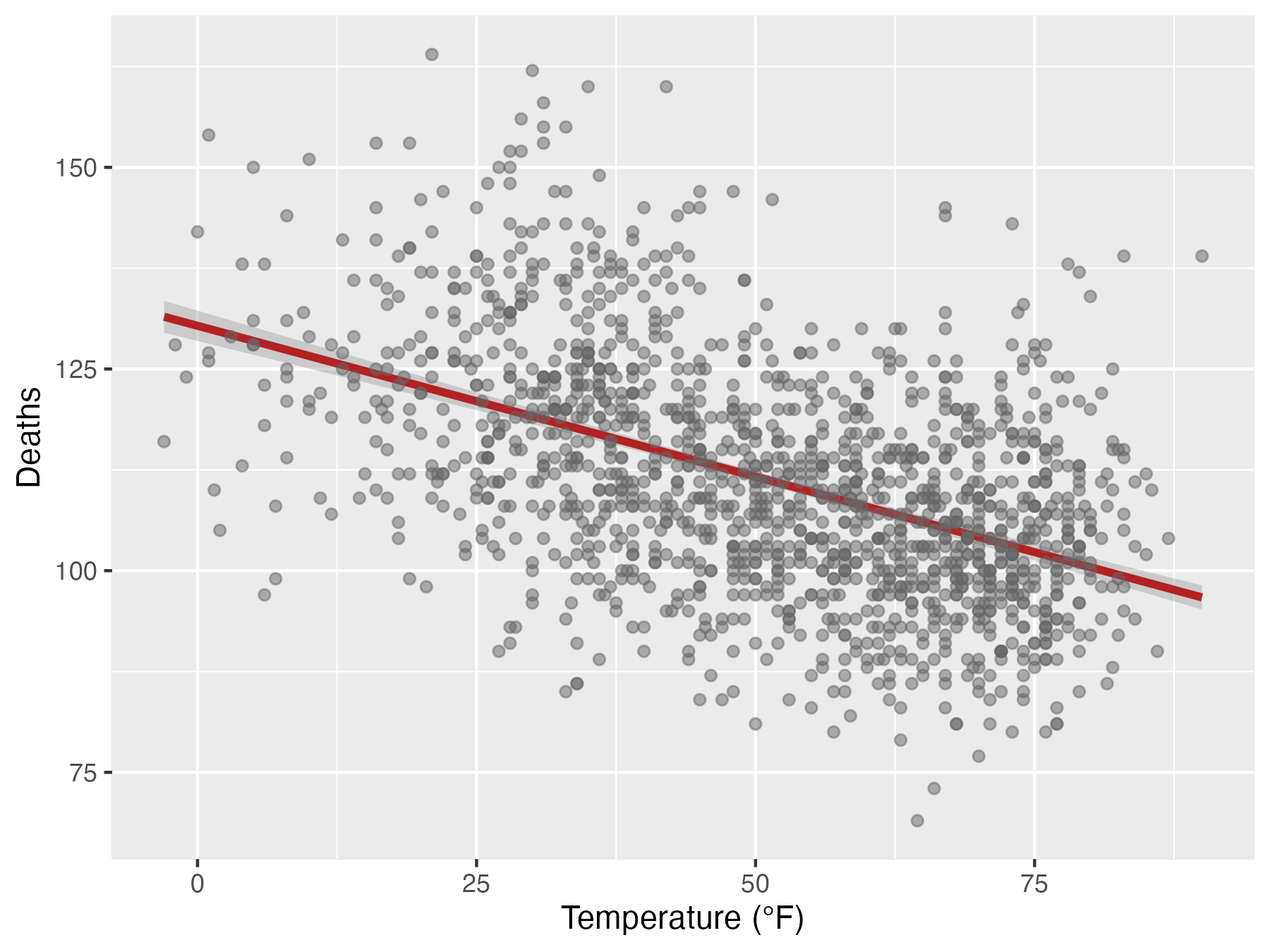
还有线性拟合的方式可以自选。即在star_smooth()中明确method= “lm”,se是要不要加上标准误的区间(图上红线上下灰灰的部分)。
ggplot(chic, aes(x = temp, y = death)) + labs(x = "Temperature (°F)", y = "Deaths") + stat_smooth(method = "lm", se = T, color = "firebrick", size = 1.3) + geom_point(color = "gray40", alpha = .5)
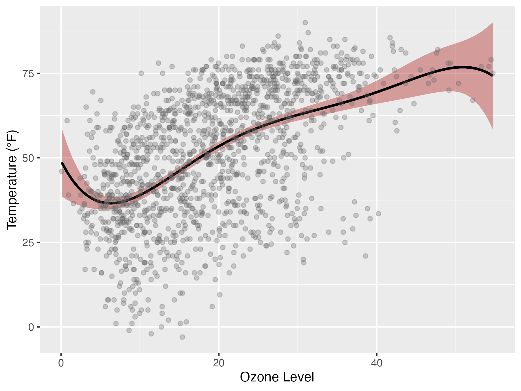
如果你想自选多项式,也可以自己写公式。(这个我不会写,只会抄)
但是自己写的公式只能写在geom_smooth()里,写法也有点不一样。
ggplot(chic, aes(x = o3, y = temp))+ labs(x = "Ozone Level", y = "Temperature (°F)") + geom_smooth(method = "lm", formula = y ~ x + I(x^2) + I(x^3) + I(x^4) + I(x^5), color = "black",fill = "firebrick") +geom_point(color = "gray40", alpha = .3)
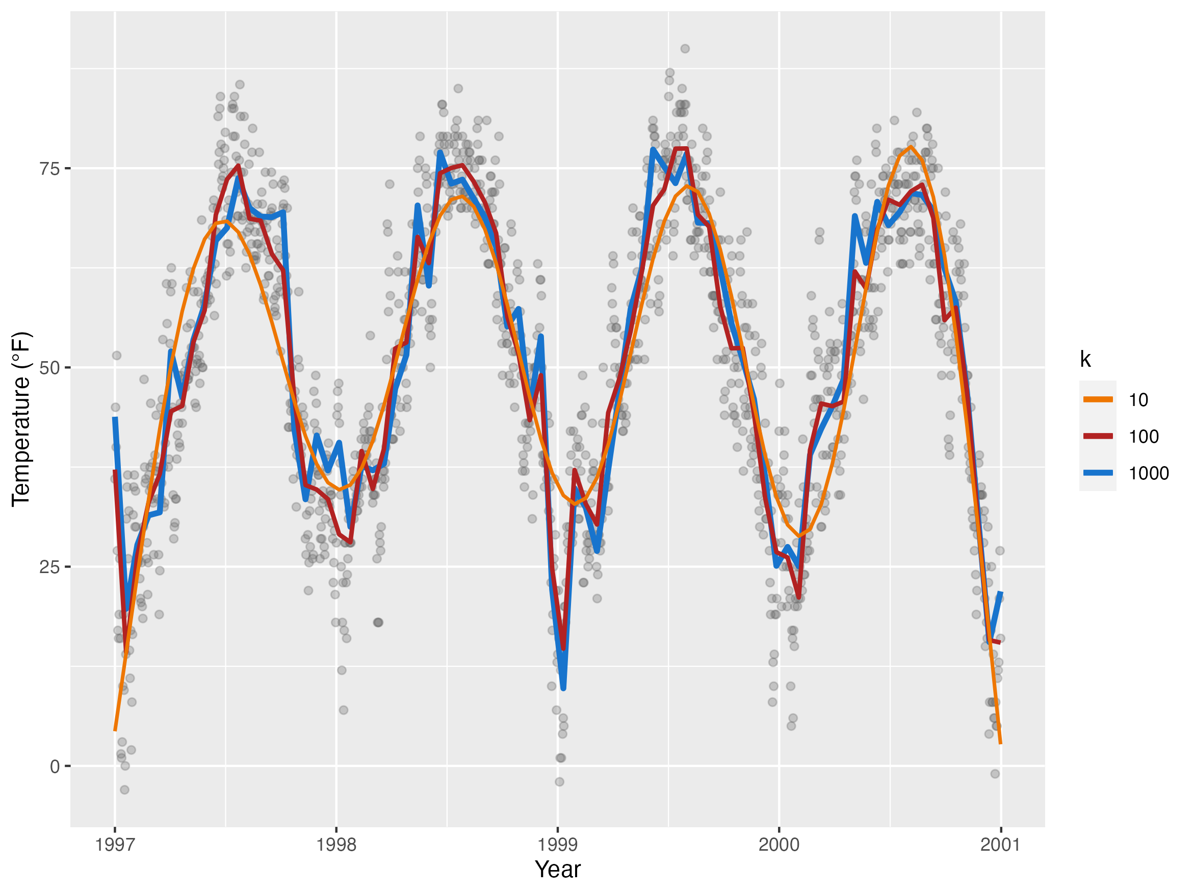
在GAM模型中(数据量超过一万时默认进行平滑的方式),可以调整平滑力度。具体怎么调整我也不懂原理,但是就是调整stat_smooth()当中cols的参数。越大,平滑力度越精细(反过来说也就越不平滑)。
cols <- c("darkorange2", "firebrick", "dodgerblue3")
p <- ggplot(chic, aes(x = date, y = temp)) + geom_point(color = "gray40", alpha = .3) + labs(x = "Year", y = "Temperature (°F)") + stat_smooth(aes(col = "1000"), method = "gam", formula = y ~ s(x, k = 1000),se = FALSE, size = 1.3) + stat_smooth(aes(col = "100"), method = "gam", formula = y ~ s(x, k = 100), se = FALSE, size = 1) + stat_smooth(aes(col = "10"), method = "gam", formula = y ~ s(x, k = 10), se = FALSE, size = .8) + scale_color_manual(name = "k", values = cols)
ggplot2能讲的基本就讲完了。最多还有一个部分是讲交互式图表的。大家九月底再见吧。
