@agpwhy
2021-06-29T07:05:05.000000Z
字数 3604
阅读 438
王胖的生信笔记第11期:Facet是什么
回到第五期开始水这个ggplot2教程系列的时候开篇说过
ggplot2里面有个概念叫facet。这个是分面设置。
那到底什么是facet,facet又怎么运用呢?
https://dictionary.cambridge.org/zhs/%E8%AF%8D%E5%85%B8/%E8%8B%B1%E8%AF%AD/facet
那就让小编随大家来看看吧。
Facet两大利器
关于facet由两个函数facet_wrap 和 facet_grid 。具体这两个有啥区别,简单来说第一个是通过一个变量的区别来分面(比如不同季节),第二通过两个不同变量的区别来分面(不同季节&不同地点)。我们在实践中来看看吧。
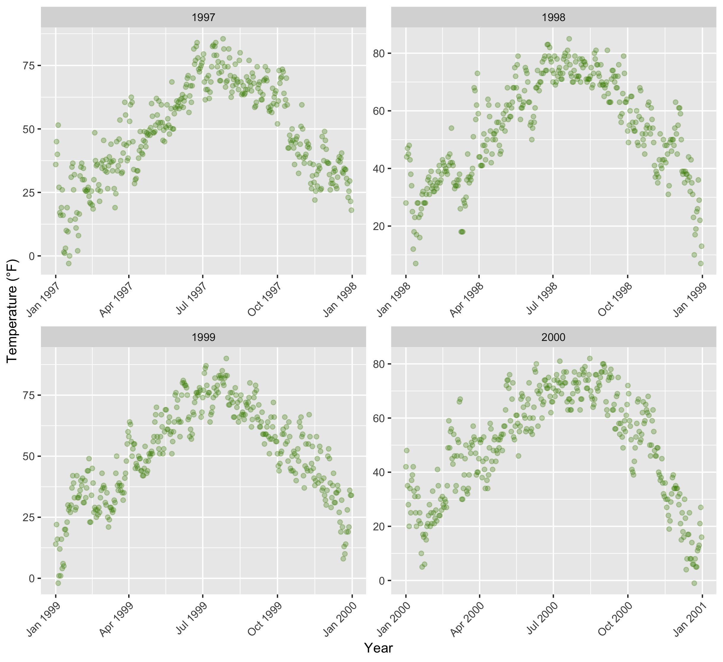
ggplot(chic, aes(x = date, y = temp)) + geom_point(color = "orangered", alpha = .3) + theme(axis.text.x = element_text(angle = 45, vjust = 1, hjust = 1)) + labs(x = "Year", y = "Temperature (°F)") + facet_grid(year ~ season)
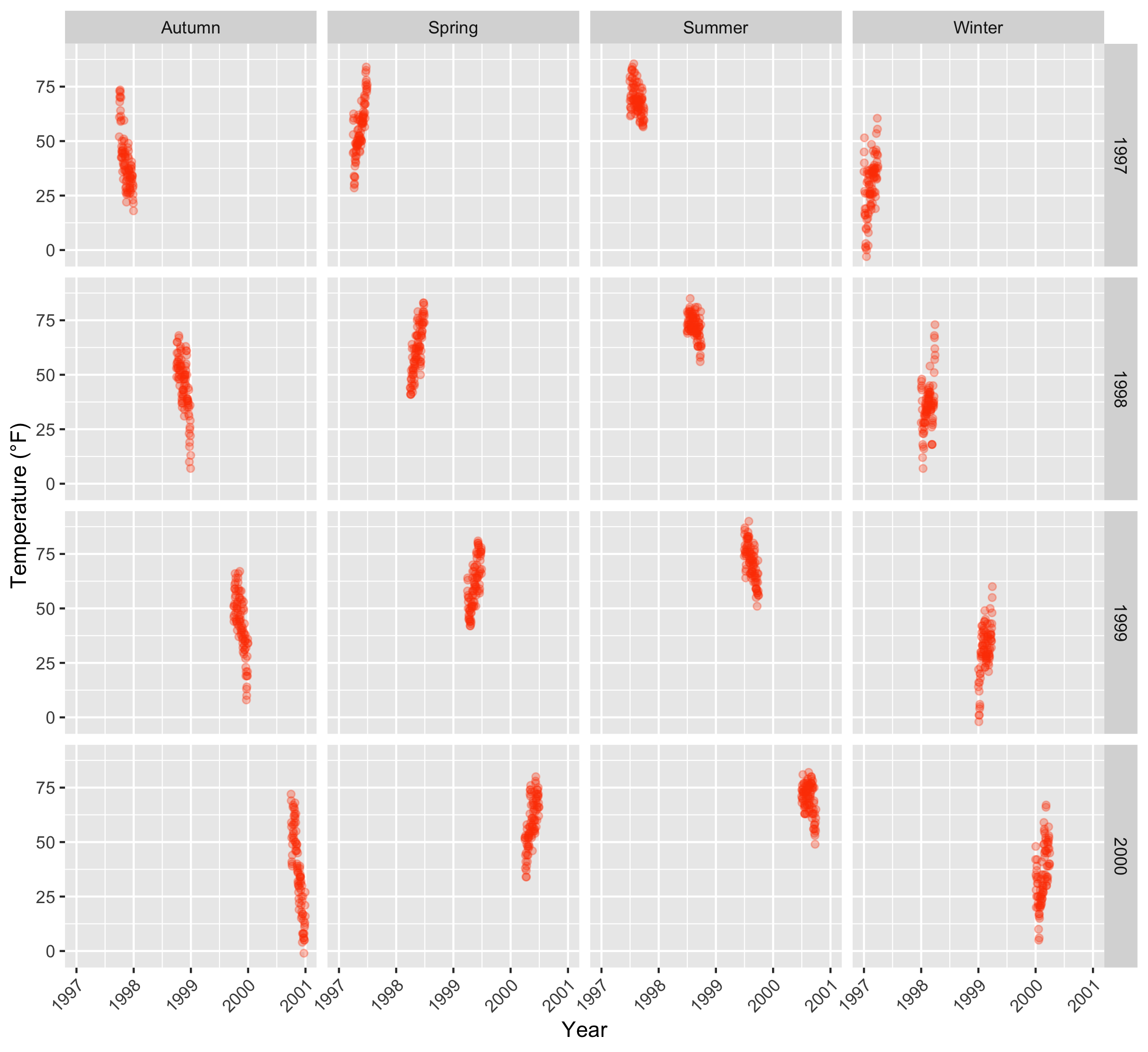
这就是facet_grid()的运用,其中第一个变量体现在竖的方向上,第二个体现在横的方向上。
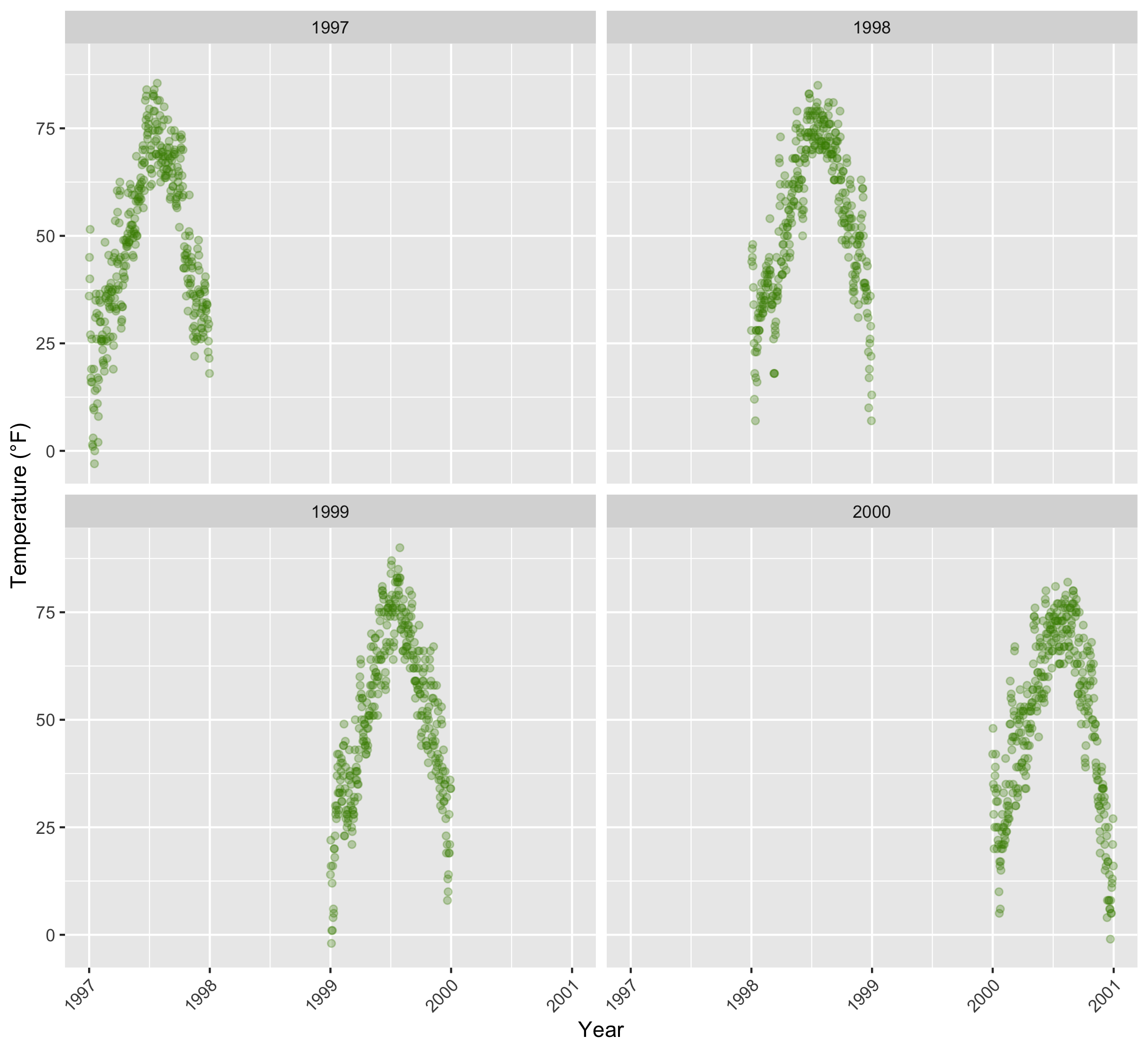
那facet_wrap()呢?
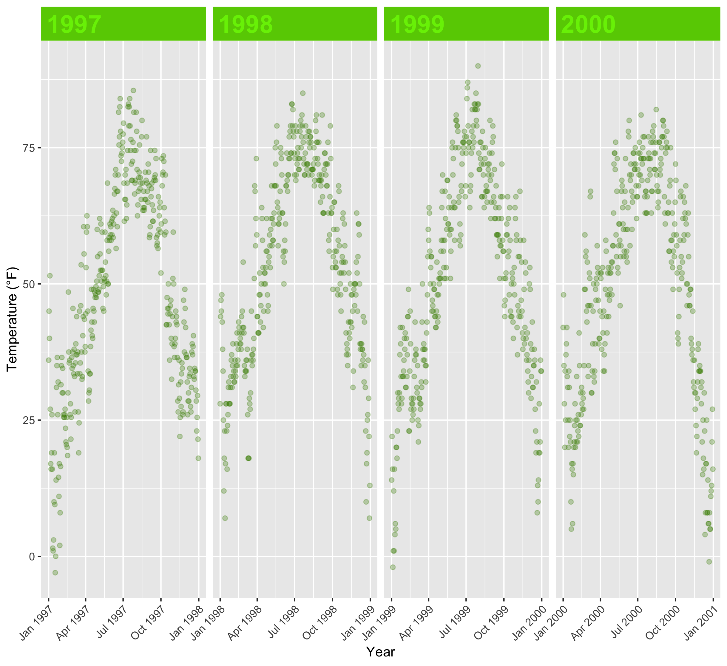
g <- ggplot(chic, aes(x = date, y = temp)) + geom_point(color = "chartreuse4", alpha = .3) + labs(x = "Year", y = "Temperature (°F)") + theme(axis.text.x = element_text(angle = 45, vjust = 1, hjust = 1))
g + facet_wrap(~ year)
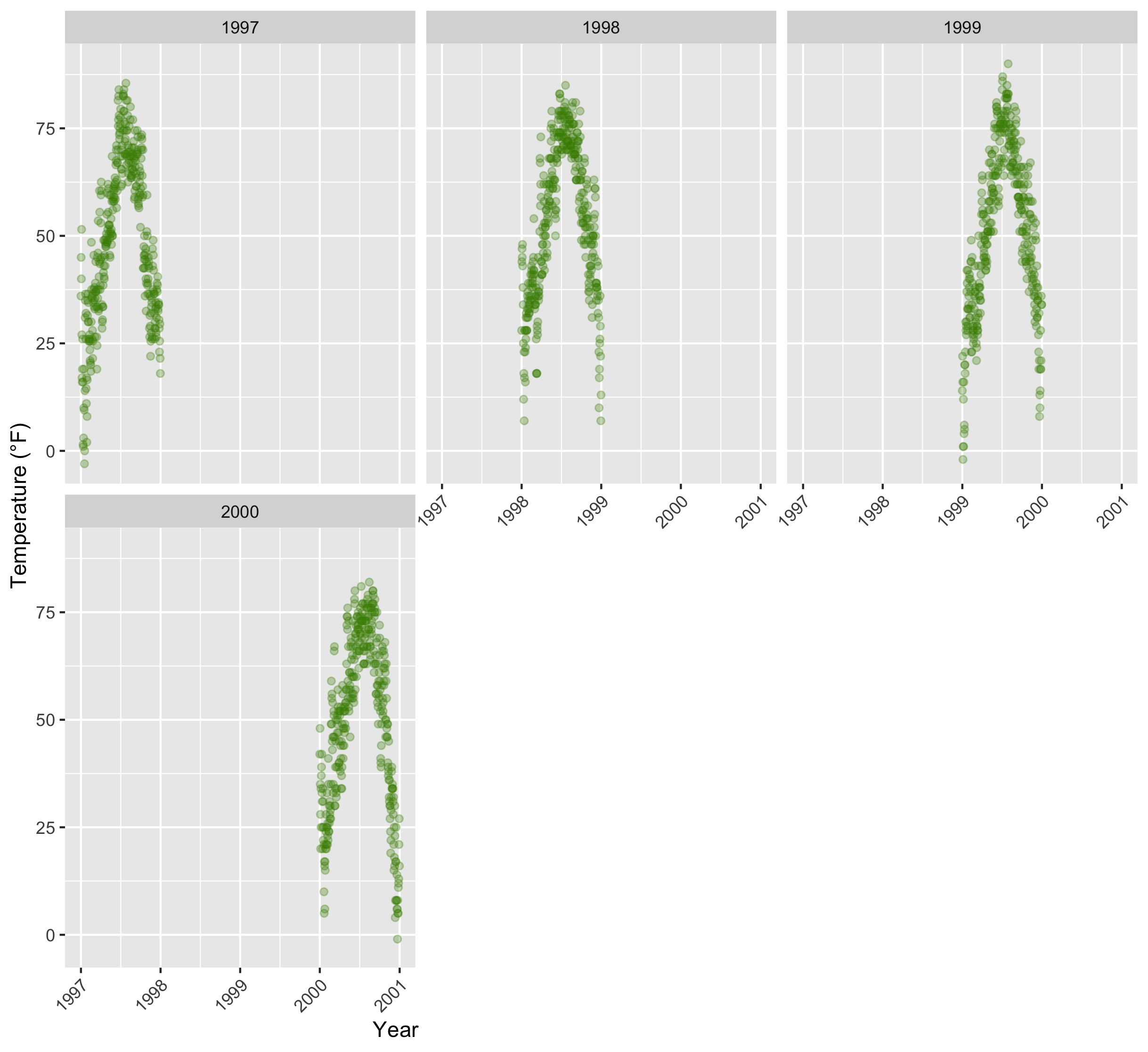
还可以设置行列
g + facet_wrap(~ year, ncol = 3)+ theme(axis.title.x = element_text(hjust = .30))
如果觉得这种偏向的数据分布感觉比较丑,可以试试这个参数
g + facet_wrap(~ year, nrow = 2, scales = "free")
说句题外话,scales在facet_grid()中也能运用,但只能用在一个变量上。
g + facet_grid(year ~ season, scales = "free_x")
facet_wrap()也能写两个变量用来分面,但是效果是不一样的。
g + facet_wrap(year ~ season, nrow = 4, scales = "free_x")
具体什么效果大家可以自己根据这些代码试试,图我就不放了。
搞得美观点
有些同学说了,这个灰底太丑了,能不能搞得好看点。能。
我们还是选个原谅色,写在strip.background和strip.text的fill里。
g + facet_wrap(~ year, nrow = 1, scales = "free_x") + theme(strip.text = element_text(face = "bold", color = "chartreuse2", hjust = 0, size = 20), strip.background = element_rect(fill = "chartreuse3", linetype = "dotted"))
再说句题外话,这里的charteuse是格勒诺布尔附近的一种酒名,这个酒就是这种风油精色,味道也是风油精味道。我在格勒的时候试过一次,一言难尽。
再美观点呢?能。
需要再搞两个包。
library(ggtext)
library(rlang)
再自己写两个函数(这个我讲解不来,大家就依葫芦画葫芦吧)
element_textbox_highlight <- function(..., hi.labels = NULL, hi.fill = NULL, hi.col = NULL, hi.box.col = NULL, hi.family = NULL) { structure( c(element_textbox(...), list(hi.labels = hi.labels, hi.fill = hi.fill, hi.col = hi.col, hi.box.col = hi.box.col, hi.family = hi.family) ), class = c("element_textbox_highlight", "element_textbox", "element_text", "element") ) }
element_grob.element_textbox_highlight <- function(element, label = "", ...) { if (label %in% element$hi.labels) { element$fill <- element$hi.fill %||% element$fill element$colour <- element$hi.col %||% element$colour element$box.colour <- element$hi.box.col %||% element$box.colour element$family <- element$hi.family %||% element$family } NextMethod() }
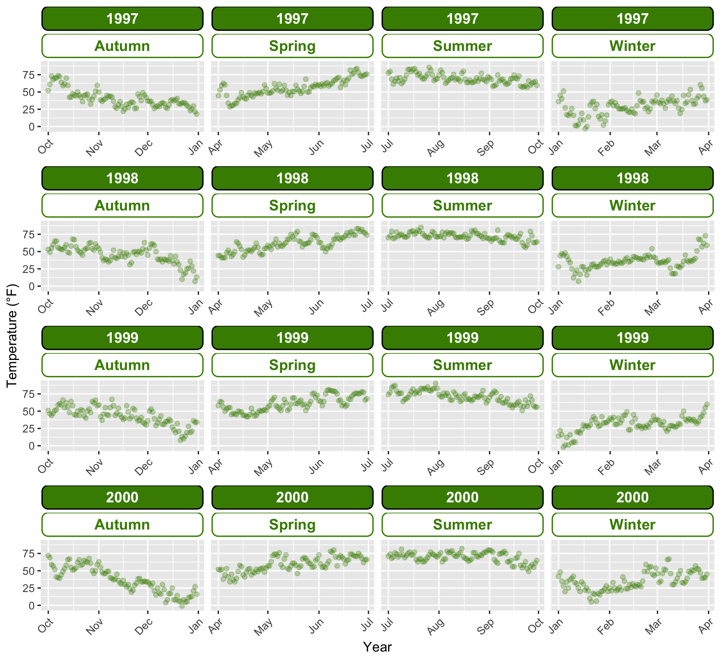
g + facet_wrap(year ~ season, nrow = 4, scales = "free_x") + theme( strip.background = element_blank(), strip.text = element_textbox_highlight( size = 12, face = "bold", fill = "white", box.color = "chartreuse4", color = "chartreuse4", halign = .5, linetype = 1, r = unit(5, "pt"), width = unit(1, "npc"), padding = margin(5, 0, 3, 0), margin = margin(0, 1, 3, 1), hi.labels = c("1997", "1998", "1999", "2000"), hi.fill = "chartreuse4", hi.box.col = "black", hi.col = "white" ) )
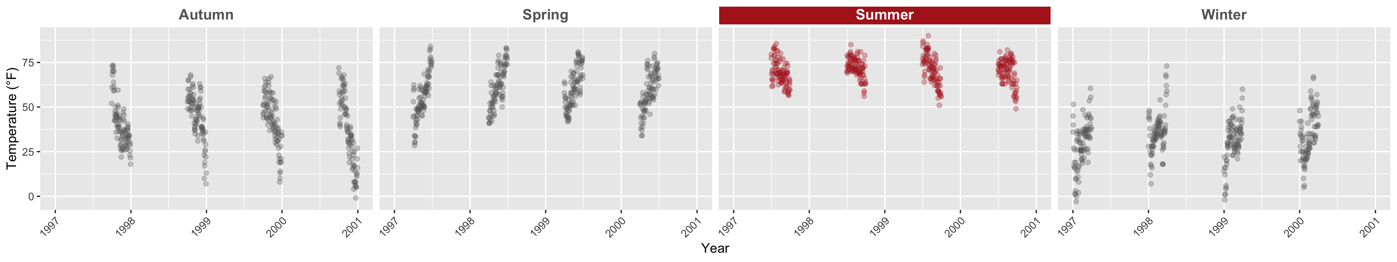
ggplot(chic, aes(x = date, y = temp)) + geom_point(aes(color = season == "Summer"), alpha = .3) + labs(x = "Year", y = "Temperature (°F)") + facet_wrap(~ season, nrow = 1) + scale_color_manual(values = c("gray40", "firebrick"), guide = "none") + theme( axis.text.x = element_text(angle = 45, vjust = 1, hjust = 1), strip.background = element_blank(), strip.text = element_textbox_highlight( size = 12, face = "bold", fill = "white", box.color = "white", color = "gray40", halign = .5, linetype = 1, r = unit(0, "pt"), width = unit(1, "npc"), padding = margin(2, 0, 1, 0), margin = margin(0, 1, 3, 1), hi.labels = "Summer", hi.fill = "firebrick", hi.box.col = "firebrick", hi.col = "white" ) )
突出一个就对那个部分再写一个geom_point()
搞两张不同的图
那以上这些都是搞得类似的图,能不能在一张画布上放上一些不同类型的图呢?
能。
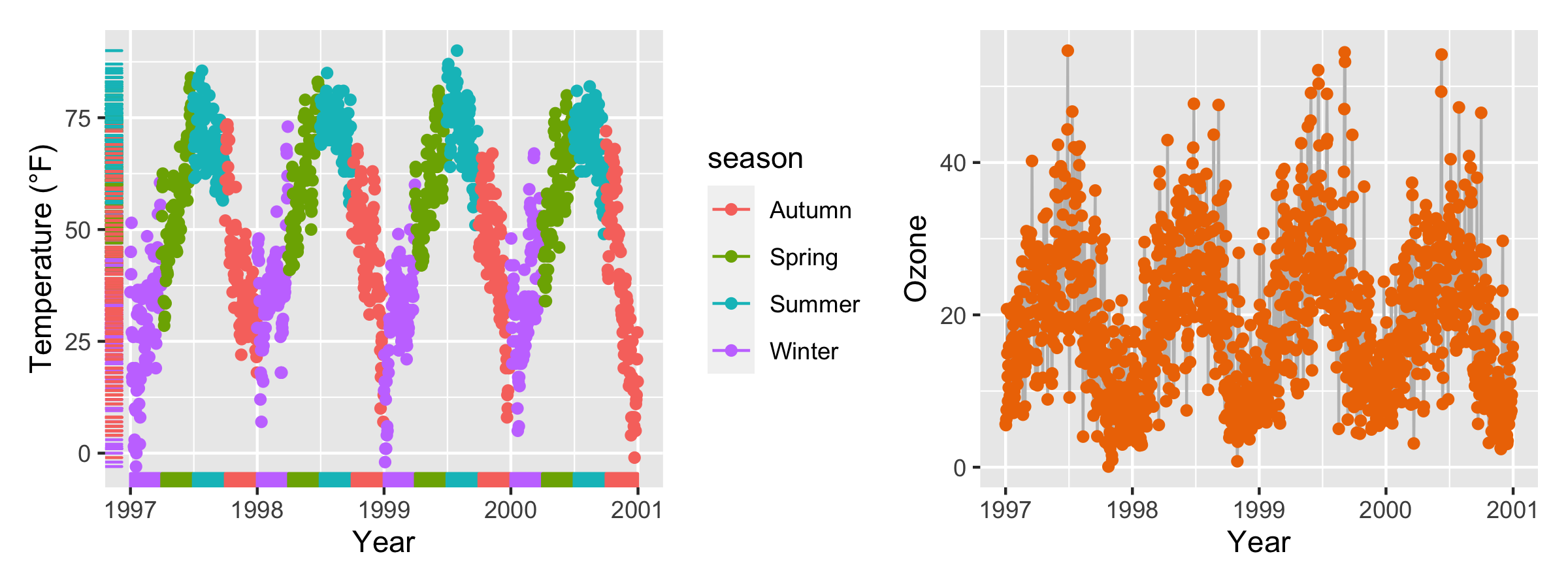
p1 <- ggplot(chic, aes(x = date, y = temp, color = season)) + geom_point() + geom_rug() + labs(x = "Year", y = "Temperature (°F)")
p2 <- ggplot(chic, aes(x = date, y = o3)) + geom_line(color = "gray") + geom_point(color = "darkorange2") + labs(x = "Year", y = "Ozone")
p1 + p2
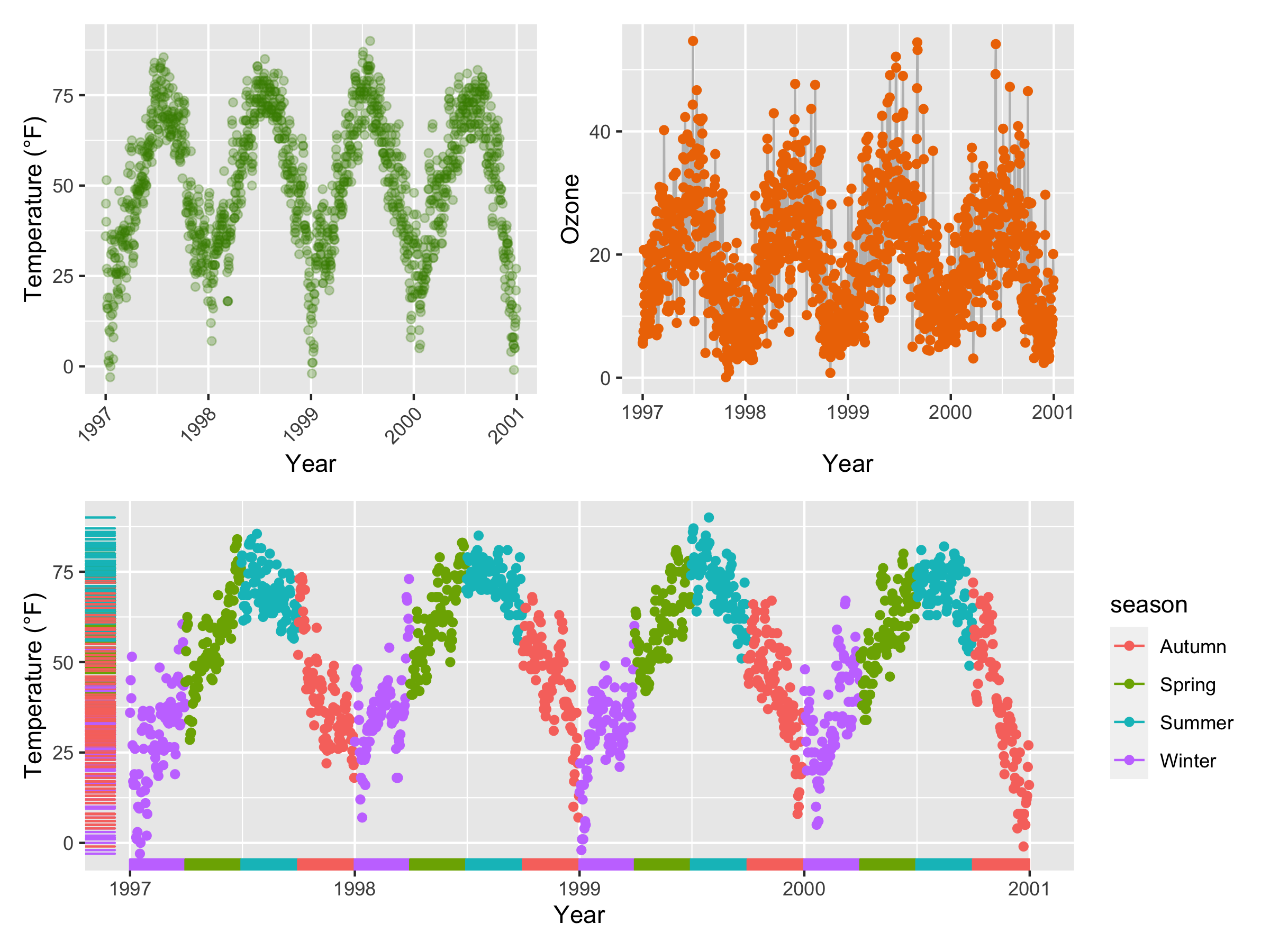
(g + p2) / p1
还有一些花活。
library(cowplot) plot_grid(plot_grid(g, p2), p1, ncol = 1)
library(gridExtra) grid.arrange(g, p2, p1, layout_matrix = rbind(c(1, 2), c(3, 3)))
这两个一样可以画出上面那张图
还有一个很骚气的操作
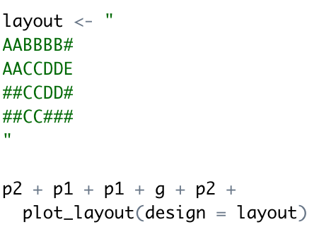
大家自己去操作下看看效果吧。
