@agpwhy
2021-06-05T07:07:42.000000Z
字数 1614
阅读 409
王胖的生信笔记8:搞定图例
前面讲了怎么搞定坐标轴,搞定标题标注。
这一期来讲下怎么搞定图例。
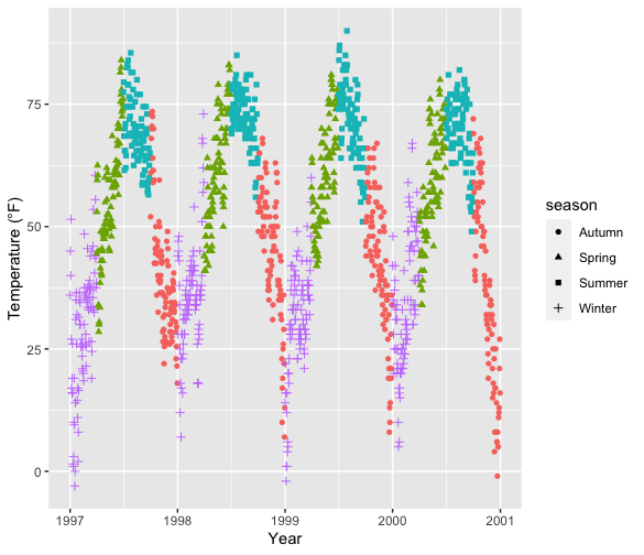
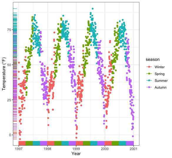
按季节上色
在aes里加一个color,就可以填写上色的标准了。
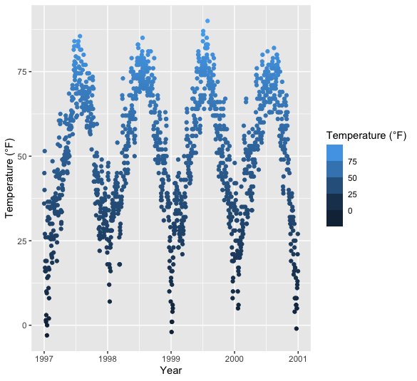
ggplot(chic, aes(x = date, y = temp, color = season)) + geom_point() + labs(x = "Year", y = "Temperature (°F)")
ggplot2这个自动会按照color加图例。

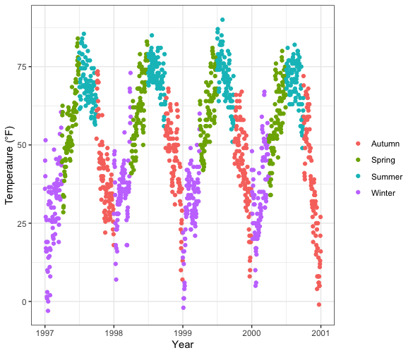
不想要要么就自己裁剪一下,要么就简单加一句 + theme(legend.position = "none")
当然还有其他”茴“字的写法guides(color = "none") 和scale_color_discrete(guide = "none")
当然有不同的效果,比如当你除了颜色,还加了一些其他theme的元素,那这时候用 + theme(legend.position = "none") 就直接啥也不显示了,但是用后两种,还能展现这样的效果,即单纯不显示颜色区分,而保留其他区分。
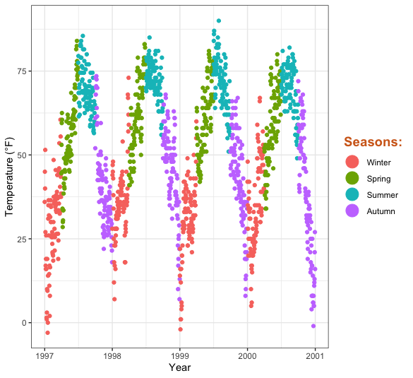
去除图例的标题
ggplot(chic, aes(x = date, y = temp, color = season)) + geom_point() + labs(x = "Year", y = "Temperature (°F)") + theme(legend.title = element_blank())
我就看图例上的Season特别不顺眼,那怎么办呢?(使用PPT进行裁剪),可以使用legend.title = element_blank()加在theme里。同时当然还有其他”茴“字的写法scale_color_discrete(name = NULL) 和 labs(color = NULL)。
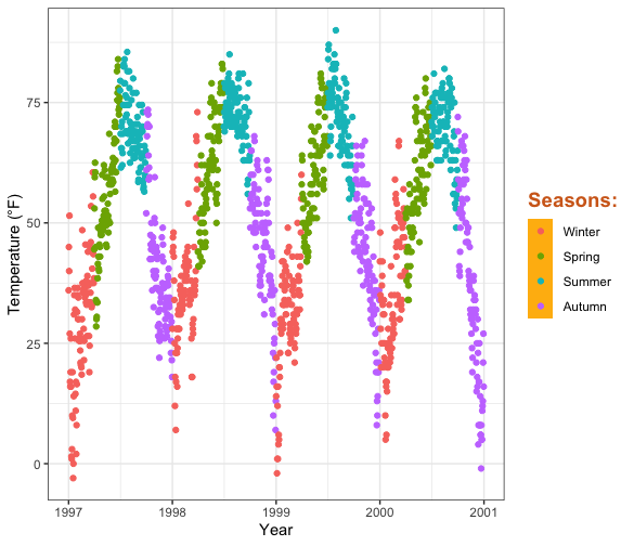
改变图例的方向和位置
ggplot(chic, aes(x = date, y = temp, color = season)) + geom_point() + labs(x = "Year", y = "Temperature (°F)") + theme(legend.position = c(.5, .97), legend.background = element_rect(fill = "transparent")) + guides(color = guide_legend(direction = "horizontal"))
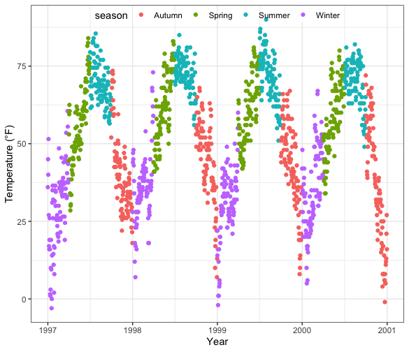
就是在guides里修改方向;在theme里加legend.position = c(.5, .97)(定位在左右中点,偏上方3%的位置), legend.background = element_rect(fill = "transparent")(图例后的背景透明)
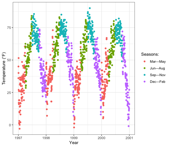
修改图例的标题 & 图例顺序
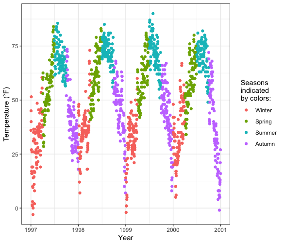
chic$season <- factor(chic$season, levels = c("Winter", "Spring", "Summer", "Autumn"))
这里factor函数里面levels参数就是设定元素顺序的方法,记得要加c()
ggplot(chic, aes(x = date, y = temp, color = season)) + geom_point()+labs(x = "Year", y = "Temperature (°F)", color = "Seasons\nindicated\nby colors:")
然后在labs里面直接color上改图例的标题名
修改图例标题
茴香豆的茴其他几种写法起到了作用啦,在scale_color_discrete() 改就行了
ggplot(chic, aes(x = date, y = temp, color = season)) + geom_point() + labs(x = "Year", y = "Temperature (°F)") + scale_color_discrete( name = "Seasons:", labels = c("Mar—May", "Jun—Aug", "Sep—Nov", "Dec—Feb") )
其他的一些奇技淫巧
这个有机会下次再说了(下周有个考试,先咕咕咕一周)
