@agpwhy
2021-05-25T03:14:21.000000Z
字数 2111
阅读 411
王胖的生信笔记7:傻瓜式调节ggplot2
首先来点常规的:搞定标注和标题
ggplot(chic, aes(x = date, y = temp)) + geom_point(color = "firebrick") + labs(x = "Year", y = "Temperature (°F)") + ggtitle("Temperatures in Chicago")
【已经把部分字符改成中文应该怎么写了,这里就偷个懒,按照教程的英语来写啦,想改中文的参考上一期】
可以用+ggtitle("")来加标题。
当然有更多的地方可以加,比如
ggplot(chic, aes(x = date, y = temp)) + geom_point(color = "firebrick") + labs(x = "Year", y = "Temperature (°F)", title = "Temperatures in Chicago", subtitle = "Seasonal pattern of daily temperatures from 1997 to 2001", caption = "Data: NMMAPS", tag = "Fig. 1")
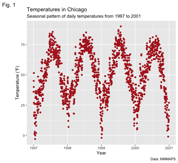
+labs()里x是横轴标题,y是y轴标题,title是总标题,subtitle是副标题,caption是右下角标注,tag是左上角标注
ggplot(chic, aes(x = date, y = temp)) + geom_point(color = "firebrick") + labs(x = "Year", y = "Temperature (°F)", title = "Temperatures in Chicago") + theme(plot.title = element_text(face = "bold", margin = margin(10, 0, 10, 0), size = 14))
调整标题的间隔,字体,粗细和上一期类似,就不再赘述了(可以自己看看这个画出来是啥样)
值得一提的是,调整间隔并不是直接调节具体位置。具体位置使用hjust,vjust来调,是在+theme()里用plot.title = element_text(hjust= xxx ,vjust= xxx)。类似的,也可以用plot.caption,
ggplot(chic, aes(x = date, y = temp)) + geom_point(color = "firebrick") + labs(x = "Year", y = NULL, title = "Temperatures in Chicago", caption = "Data: NMMAPS") + theme(plot.title = element_text(hjust = 1, size = 16, face = "bold.italic"))
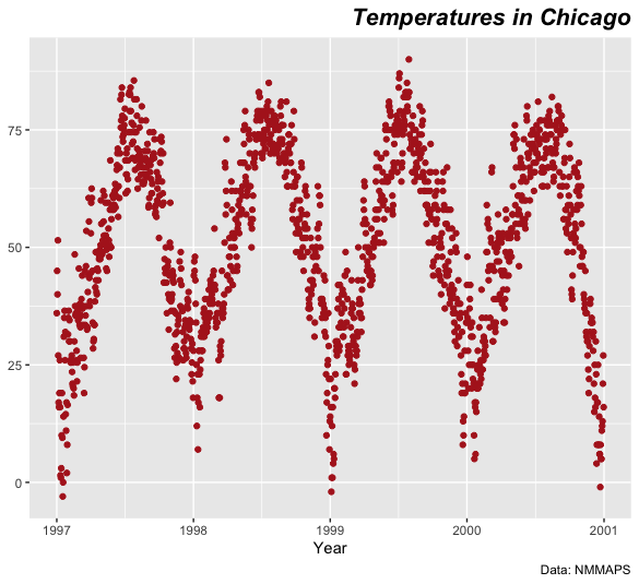
也可以通过plot.title.position=“plot”, plot.caption.position = "plot"来调整。可以自己试一下哈。
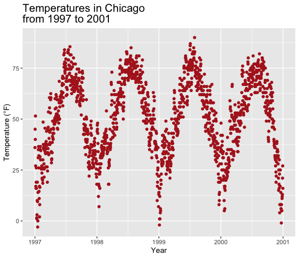
调整行间距
使用+ theme(plot.title = element_text(lineheight = .8, size = 16))可以调整多行文字的行间距。多行使用\n来换行。
ggplot(chic, aes(x = date, y = temp)) + geom_point(color = "firebrick") + labs(x = "Year", y = "Temperature (°F)") + ggtitle("Temperatures in Chicago\nfrom 1997 to 2001") + theme(plot.title = element_text(lineheight = .8, size = 16))
傻瓜包:ggThemeAssist
通过两节课的笔记,相信能读到这里的人都大概摸清了一些ggplot2调整的关键要点。简单来说就是调节几个参数,尤其是theme里的参数。
那有没有傻瓜点的包能帮助你完成这个目标呢?恭喜你。有的。R的工具包还挺多的。
library(stringr)
library(ggThemeAssist)
library(GOplot)
library(ggplot2)
chic <- readr::read_csv("https://raw.githubusercontent.com/Z3tt/R-Tutorials/master/ggplot2/chicago-nmmaps.csv")
tibble::glimpse(chic)
g <- ggplot(chic, aes(x = date, y = temp))
g + geom_line() + geom_point()
g + geom_point(color = "#C1D8F7",shape = "diamond",size = 2) + geom_line(color = "firebrick", linetype = "dotted",size = .3)
ggThemeAssistGadget(g)
然后就会跳出来一个神奇的界面(如果跳不出来,超过两个人问我可以讲下安装和实操中可能遇到的问题)
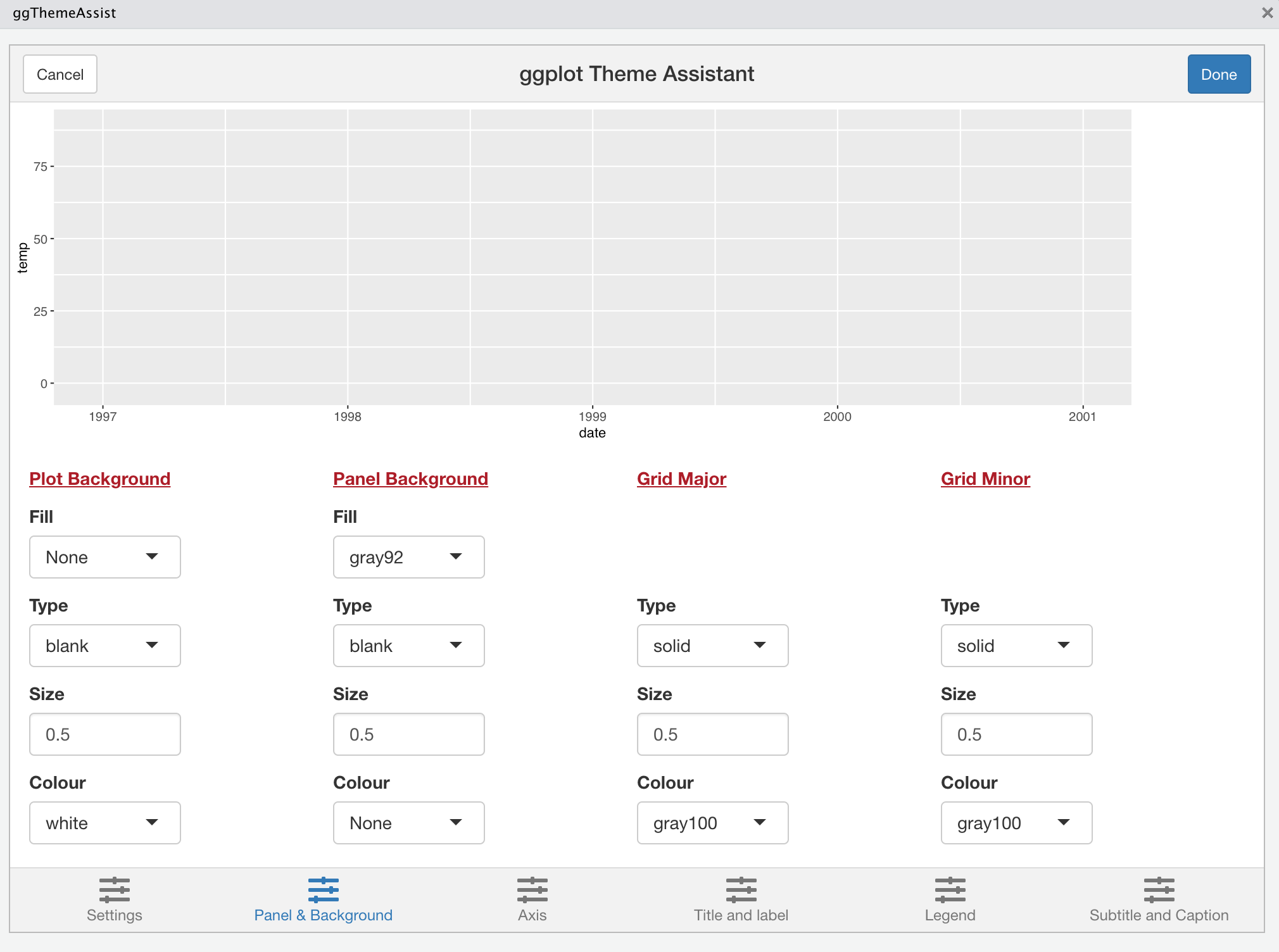
然后你各种调试之后按下右上角的Done,神奇的一幕就发生了。
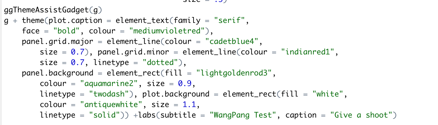
刚刚调的这些就会自动补足
然后你就run一下,很快啊。
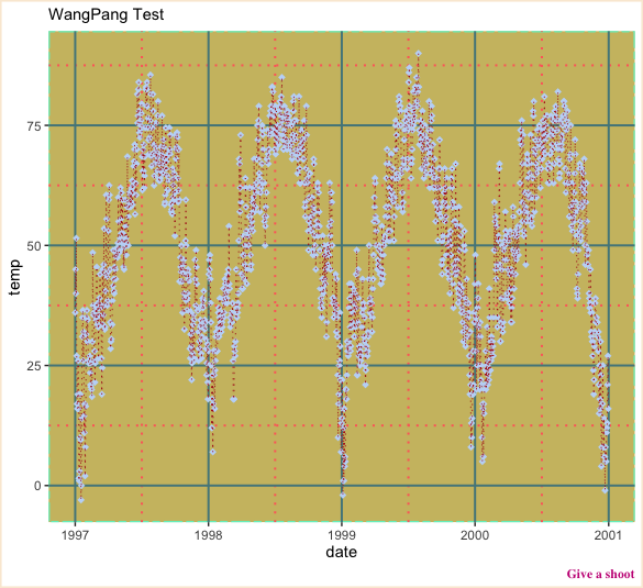
刚刚随便调出来一巨丑的图就出现了
不用再对着教程翻了,就这般傻瓜操作还不简单嘛?
