@agpwhy
2021-12-27T02:21:26.000000Z
字数 1874
阅读 630
王胖的生信笔记第31期:TidyHeatmap
面对一个矩阵数据,该怎么体现?可能一个比较合适的方式就是使用热图。
怎么让热图不这么丑呢?其实使用ComplexHeatmap已经可以做到很好看的热图了。不过调整这里面的一些参数可能比较累。今天就介绍一个方便的包TidyHeatmap
安装和介绍
devtools::install_github("stemangiola/tidyHeatmap")
https://github.com/stemangiola/tidyHeatmap
按照官网介绍,这个包优势主要包括以下四个:
指定列名帮助注释;
利用管道符就可自定义分类;
自动调整标签的大小;
使用Brewer和Viridis内置配色方案;
开始
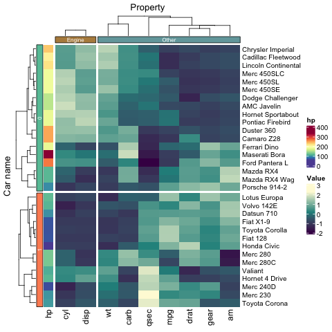
library(tidyHeatmap)library(tidyverse)mtcars_tidy =mtcars %>%as_tibble(rownames="Car name") %>%mutate_at(vars(-`Car name`, -hp, -vs), scale) %>%gather(Property, Value, -`Car name`, -hp, -vs)
就用R语言自带的数据集mtcars。结合tidyverse的运用,是格式转化为tibble(也是数据框,具体的差别可参考帮助文档https://cran.r-project.org/web/packages/tibble/vignettes/tibble.html,总之可以使得展示更加简洁,运行也更顺畅)。总之当你使用as.data.frame()不顺利的时候,就可以试试as.tibble()。
gather函数类似于Excel中的数据透视的功能。总之记住一句话:长数据变宽数据是spread(),宽数据变长数据是gather()。这个可以找推文看看,或者有机会我写一下(我理解的不是最透彻,能用但是说不好)。
总之现在手头有了一批数据了。
作图
数据列名有Car Name, Property, Value, hp。
mtcars_heatmap =mtcars_tidy %>%heatmap(`Car name`, Property, Value ) %>%add_tile(hp)
heatmap里只要指定热图的行,列,值即可。最后还能加个够注释模块。
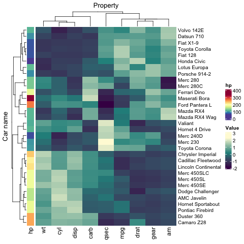
是不是还差一个vs没有用?
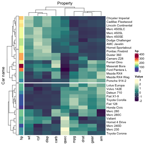
利用vs做分组。
mtcars_heatmap <- mtcars_tidy %>%group_by(vs) %>%heatmap(`Car name`, Property, Value ) %>%add_tile(hp)
美观
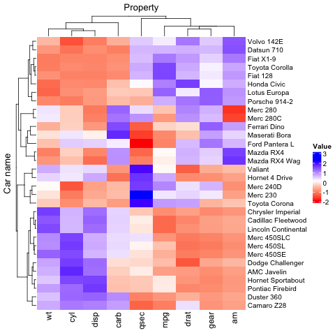
mtcars_tidy %>%heatmap(`Car name`,Property,Value,palette_value = c("red", "white", "blue"))
经典蓝红配色
mtcars_tidy_groupings =mtcars_tidy |>mutate(property_group = if_else(Property %in% c("cyl", "disp"), "Engine", "Other"))
这上面0和1你看着不明显咋整?
加上配色
mtcars_tidy_groupings |>group_by(vs, property_group) |>heatmap(`Car name`, Property, Value ,palette_grouping = list(c("#66C2A5", "#FC8D62"),c("#b58b4c", "#74a6aa"))) |>add_tile(hp)
去除legend
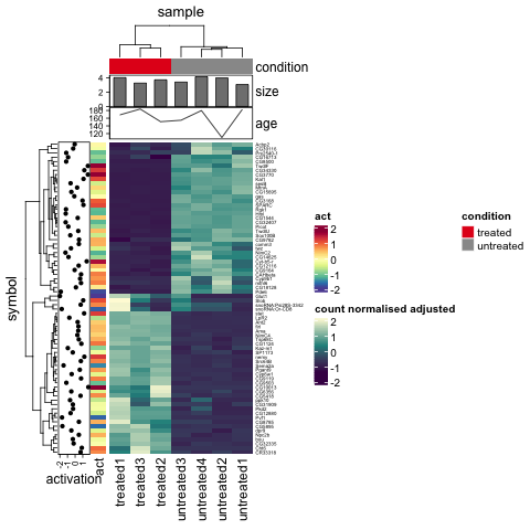
tidyHeatmap::pasilla |>group_by(location, type) |>heatmap(.column = sample,.row = symbol,.value = `count normalised adjusted`,show_heatmap_legend = FALSE) |>add_tile(condition, show_legend = FALSE) |>add_tile(activation, show_legend = FALSE)
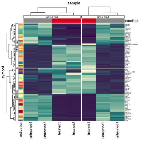
行列的注释可以改格式
pasilla_plus |>heatmap(.column = sample,.row = symbol,.value = `count normalised adjusted`) |>add_tile(condition) |>add_point(activation) |>add_tile(act) |>add_bar(size) |>add_line(age)