@agpwhy
2021-08-29T04:23:31.000000Z
字数 2589
阅读 406
王胖的生信笔记第17期:各种作图形式
最近鸽的频率比较高。可能9/20执医考试前,就再更一次吧。就简单展示一下各种图形的画图方式。
关于这个chic变量来源的文件,如果下载不方便(chic <- readr::read_csv("https://raw.githubusercontent.com/Z3tt/R-Tutorials/master/ggplot2/chicago-nmmaps.csv")),私信我,我有空就发你吧。
分组数据
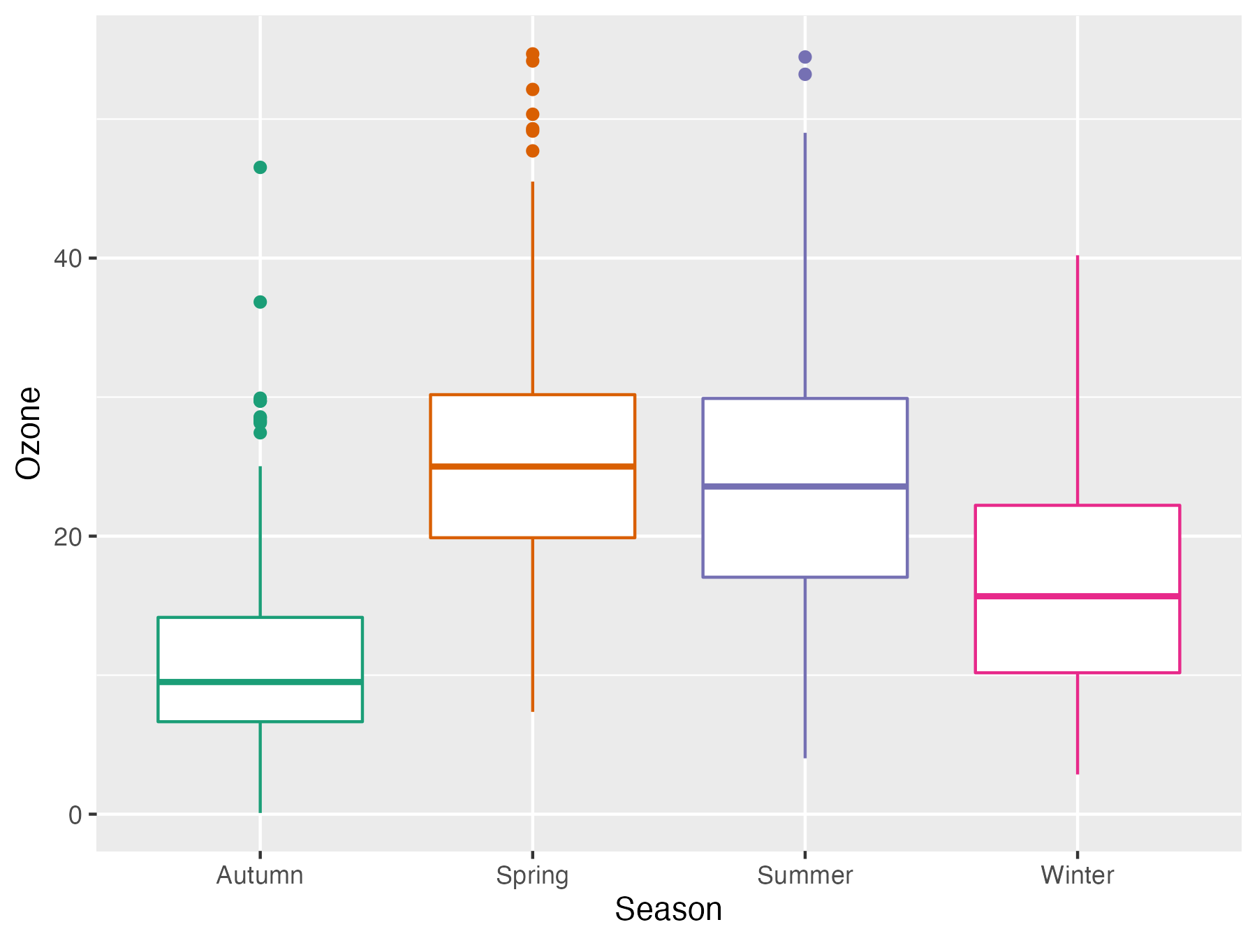
箱线图
g <- ggplot(chic, aes(x = season, y = o3, color = season)) + labs(x = "Season", y = "Ozone") + scale_color_brewer(palette = "Dark2", guide = "none") g + geom_boxplot()
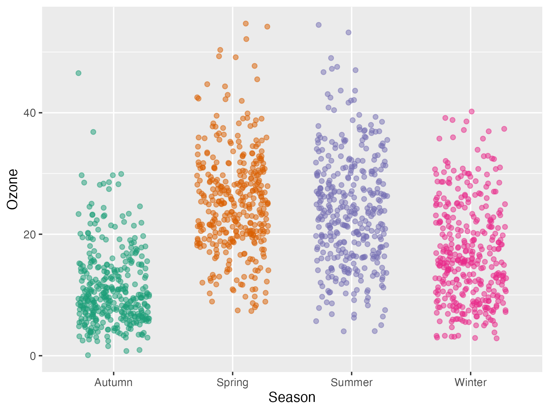
只显示点(带上透明度)
g + geom_point(alpha = .1)
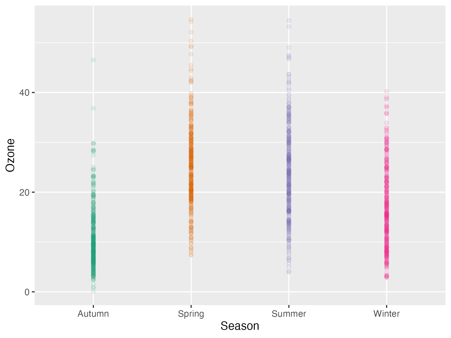
这样子集中在一条线上,不够好看,散开一点
g + geom_jitter(width = .3, alpha = .5)
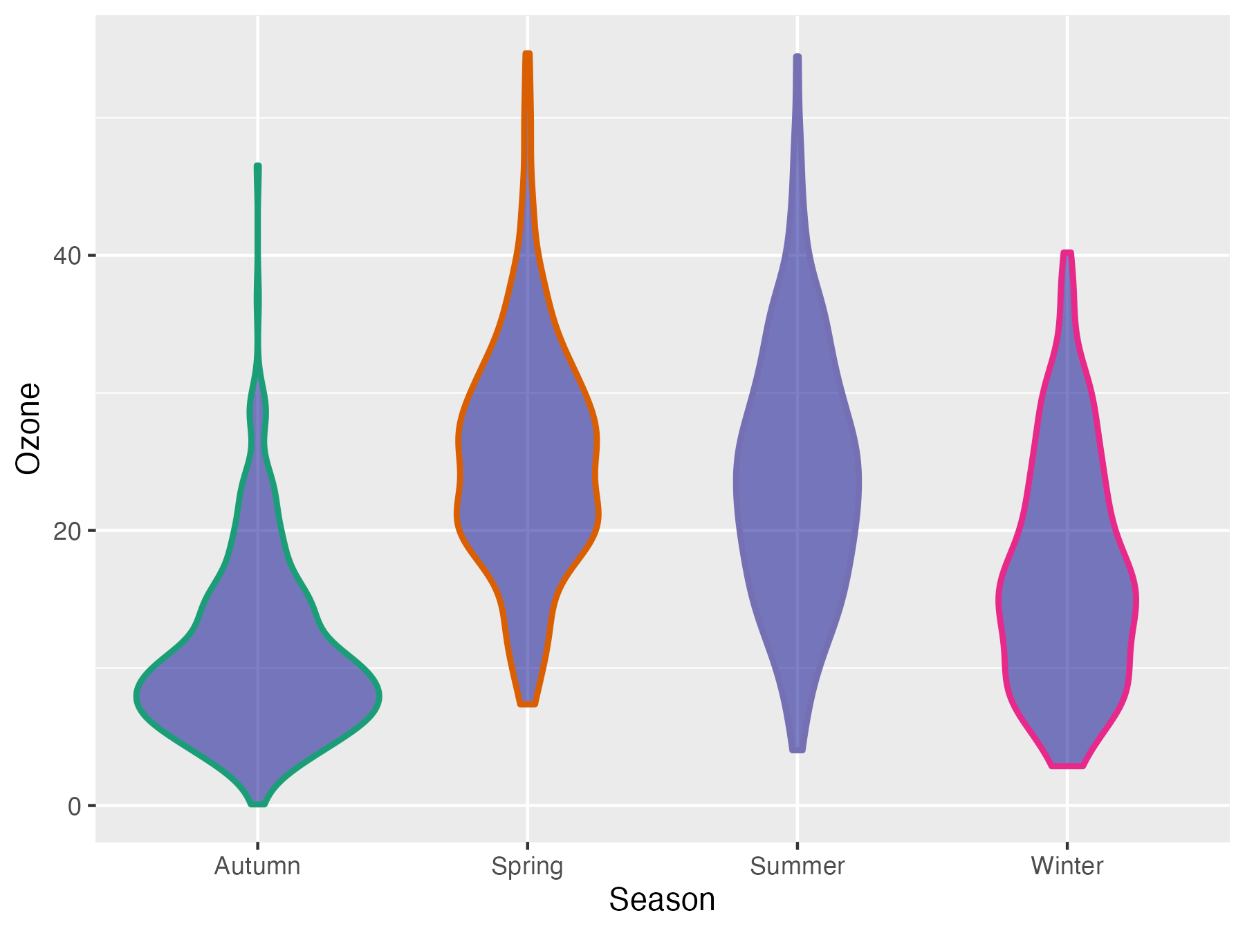
小提琴图
g + geom_violin(fill = "darkblue", size = 1, alpha = .5)
二者结合
library(ggforce)
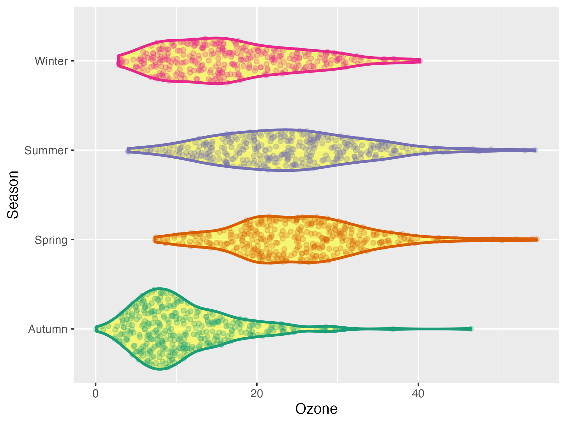
g + geom_violin(fill = "yellow", size = 1, alpha = .5) + geom_sina(alpha = .25) + coord_flip()
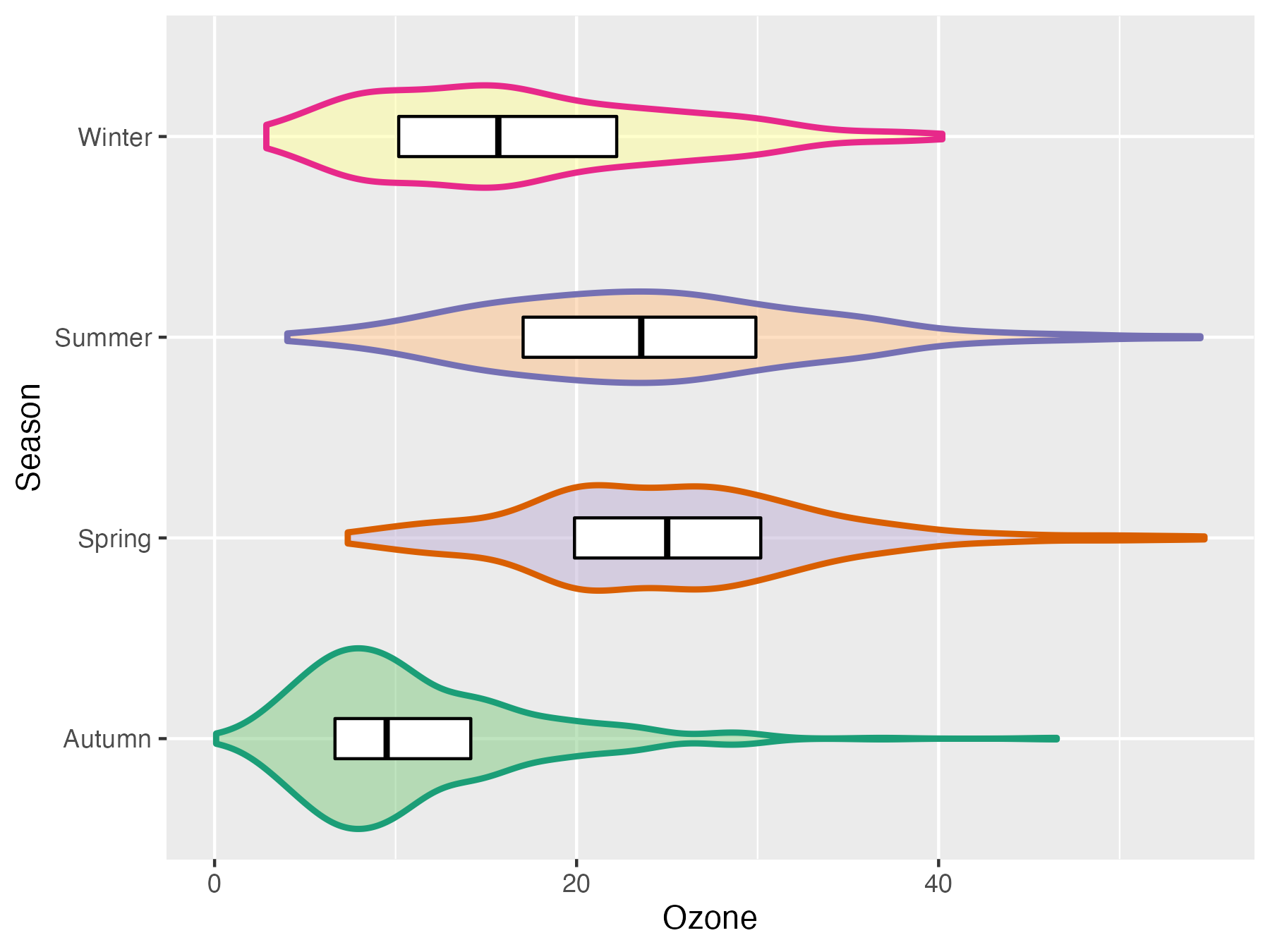
g + geom_violin(aes(fill = season), size = 1, alpha = .5) + geom_boxplot(outlier.alpha = 0, coef = 0, color = "black", width = .2) + scale_fill_brewer(palette = "Accent", guide = "none") + coord_flip()
连续数据
散点图(之前有说过怎么画这个,就是多加了一个geom_rug)
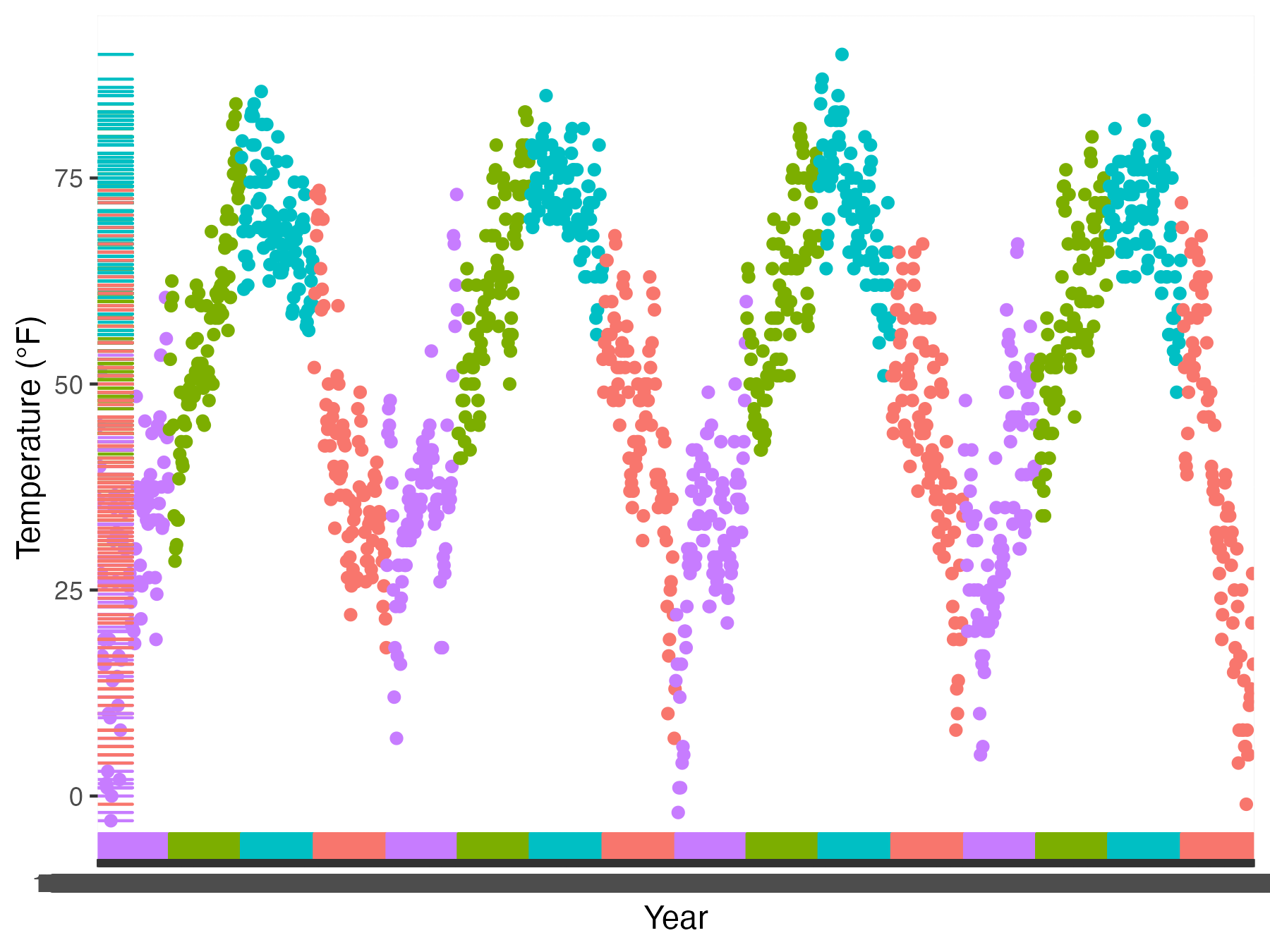
ggplot(chic, aes(x = date, y = temp, color = season)) + geom_point(show.legend = FALSE) + geom_rug(show.legend = FALSE) + labs(x = "Year", y = "Temperature (°F)")
密度图
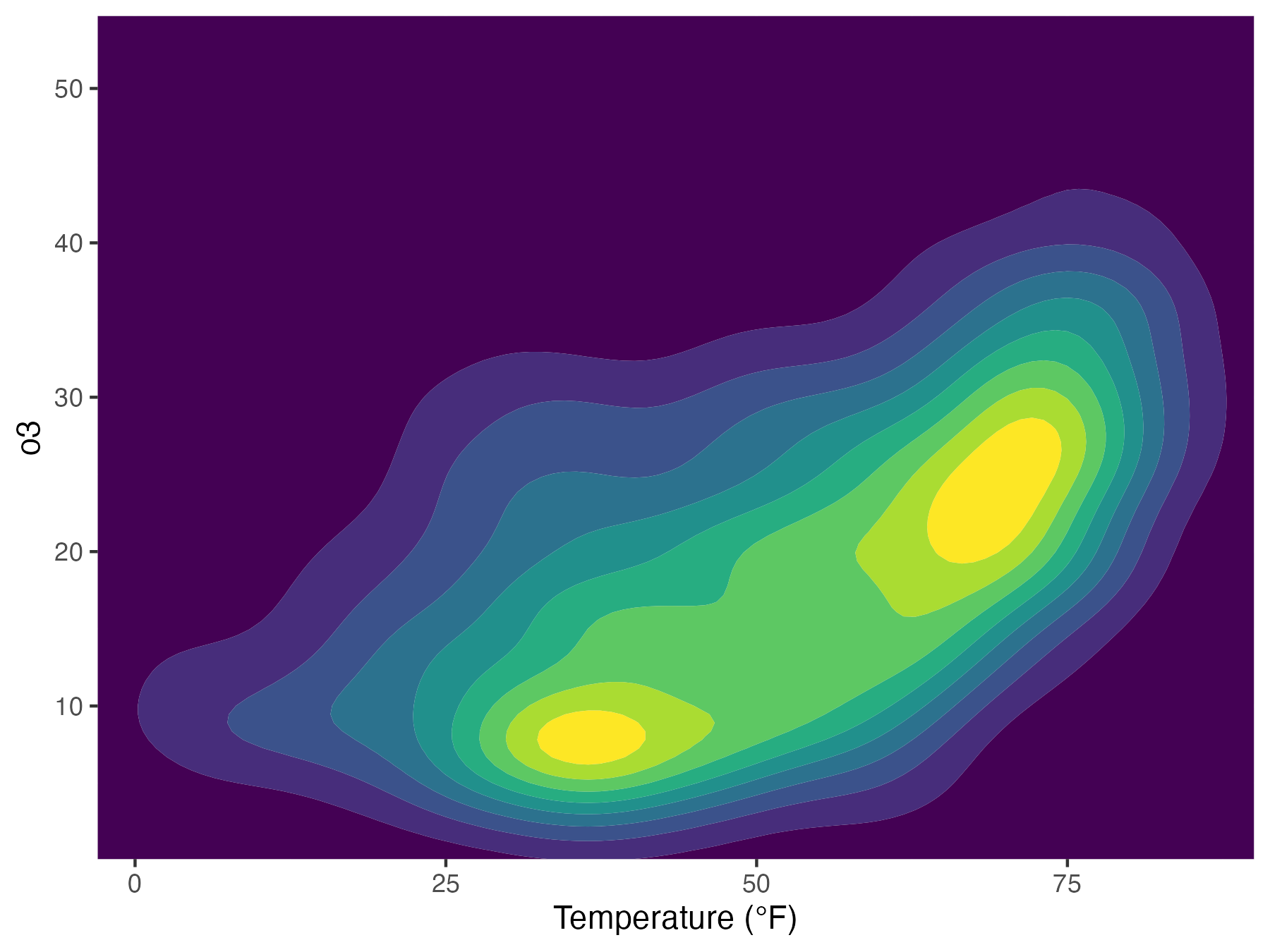
加一个geom_density_2d()
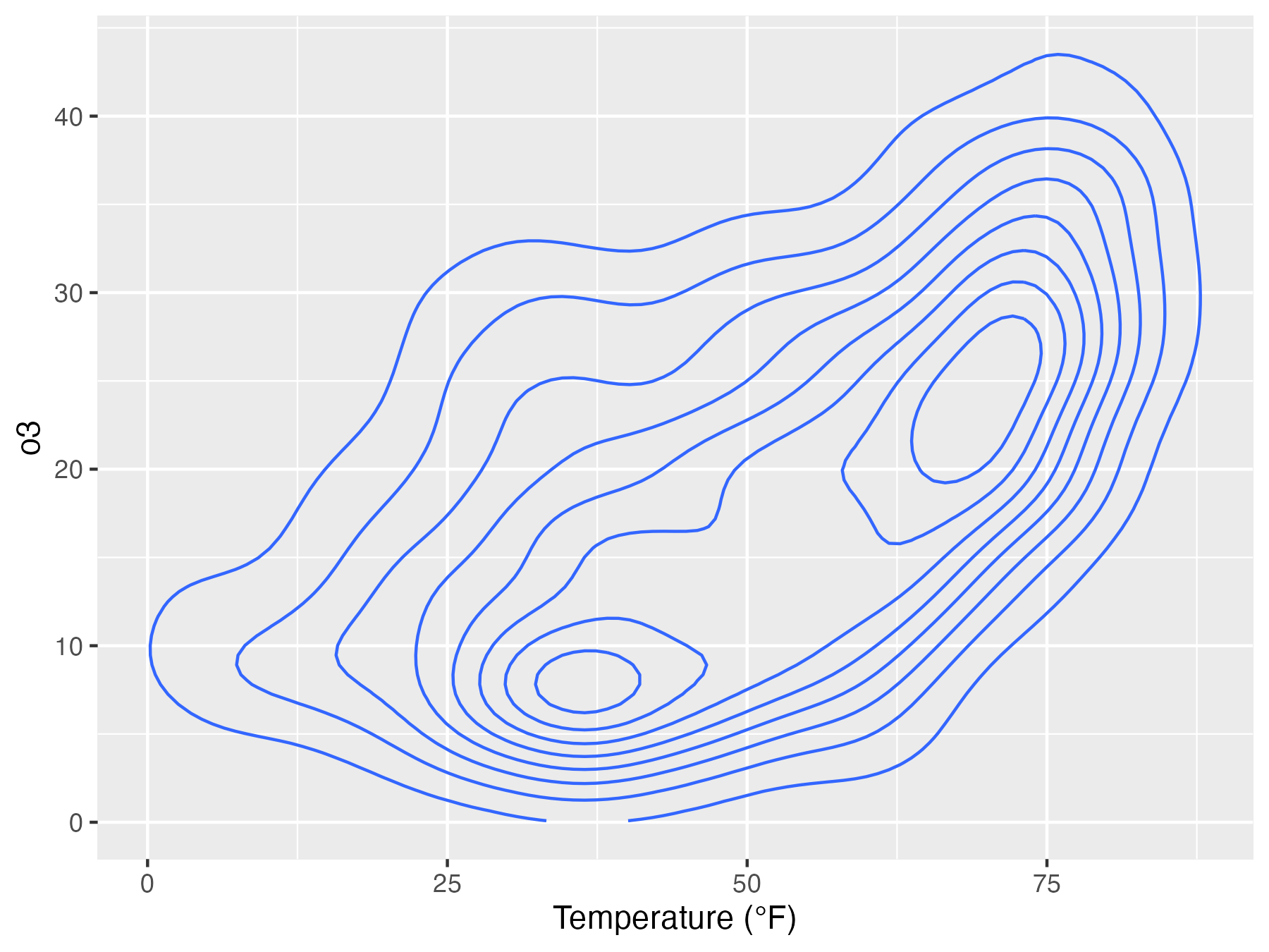
ggplot(chic, aes(temp, o3)) + geom_density_2d() + labs(x = "Temperature (°F)", x = "Ozone Level")
加上颜色
用geom_density_2d_filled(),然后用coord_cartesian(expand = FALSE)使色块填满
ggplot(chic, aes(temp, o3)) + geom_density_2d_filled(show.legend = FALSE) + coord_cartesian(expand = FALSE) + labs(x = "Temperature (°F)", x = "Ozone Level")
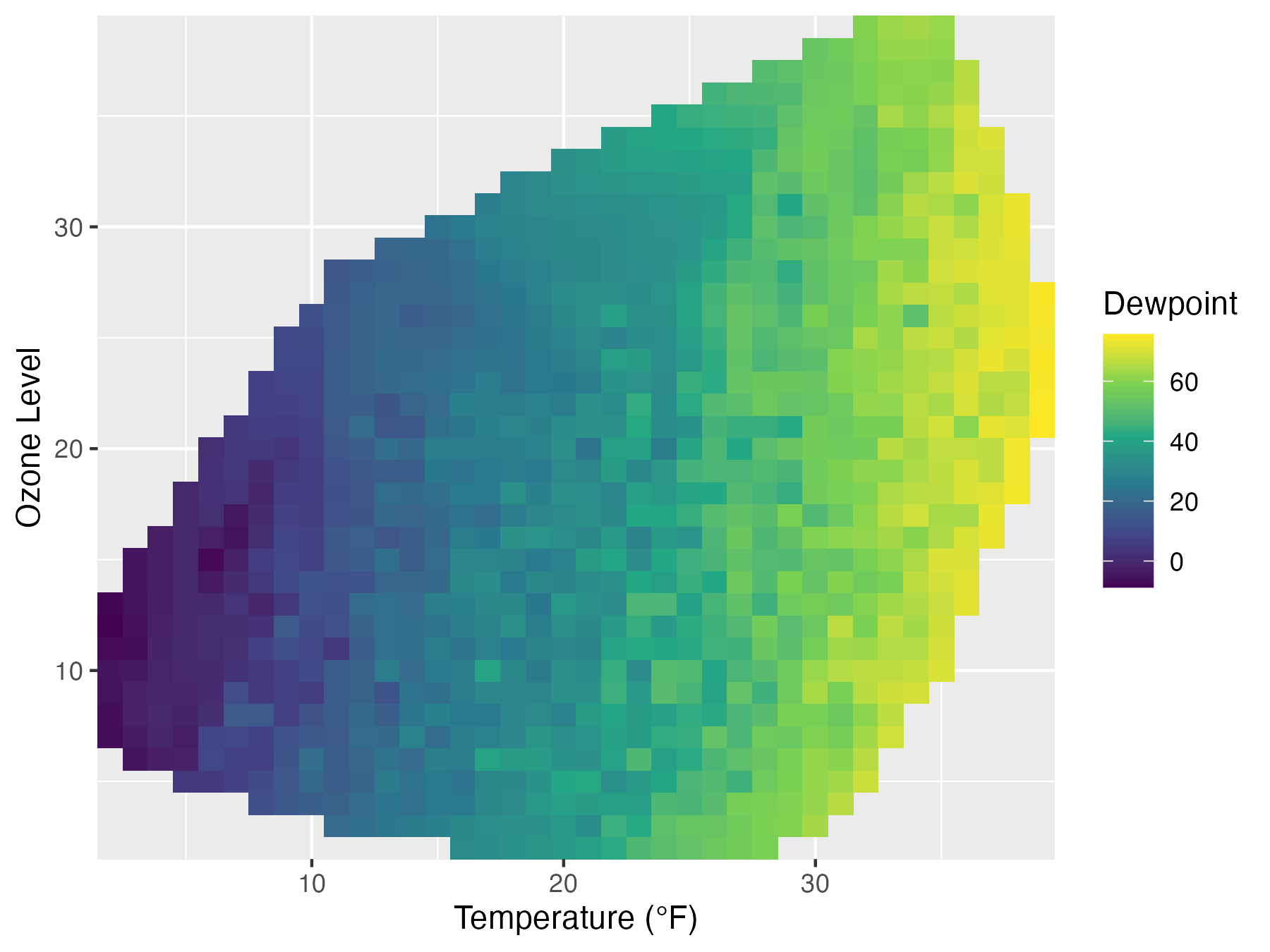
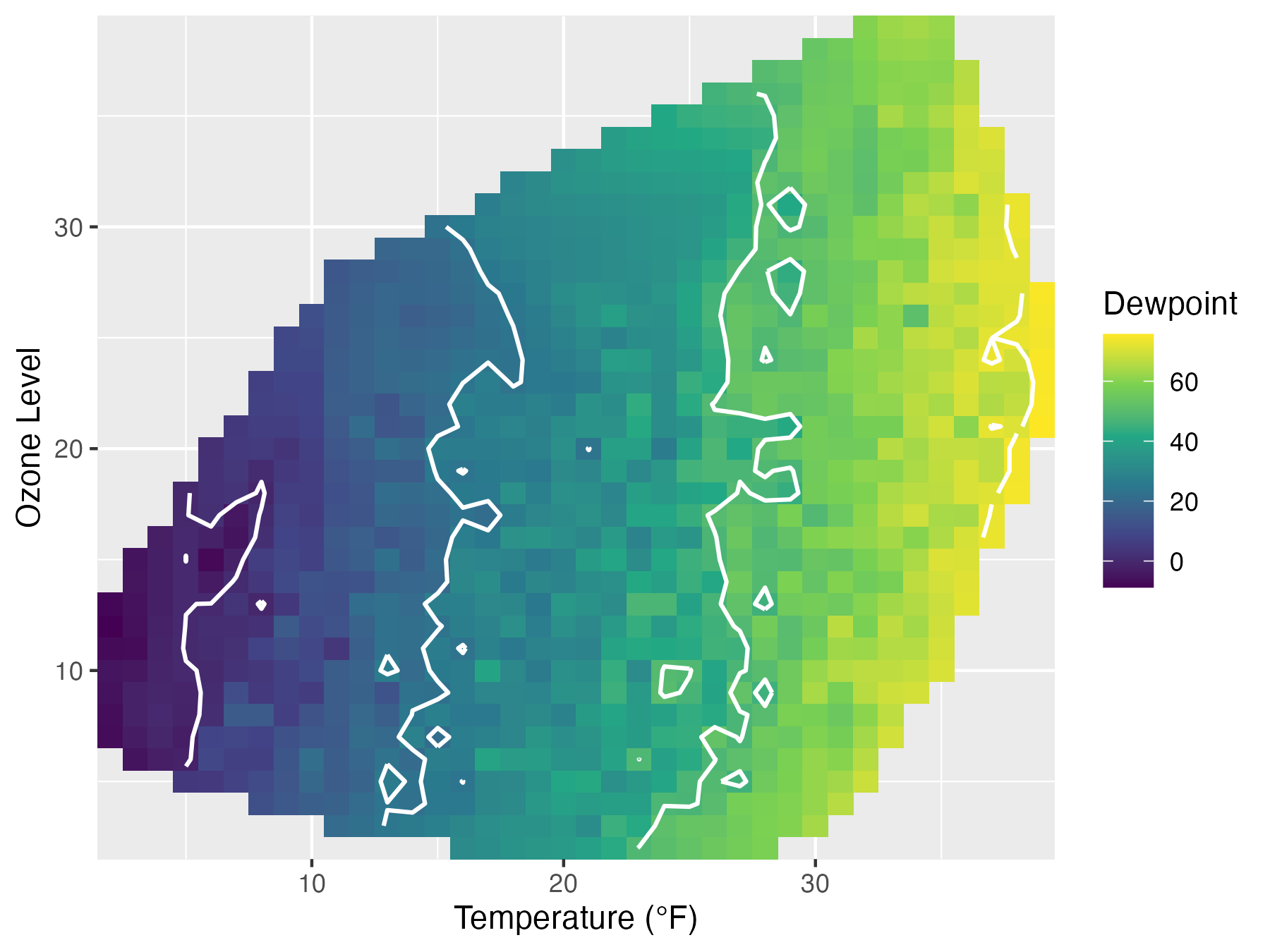
加上三维数据变成等高线图
library(akima) fld <- with(chic, interp(x = temp, y = o3, z = dewpoint))
library(reshape2) df <- melt(fld$z, na.rm = TRUE) names(df) <- c("x", "y", "Dewpoint")
g <- ggplot(data = df, aes(x = x, y = y, z = Dewpoint)) + labs(x = "Temperature (°F)", y = "Ozone Level", color = "Dewpoint")
g + geom_tile(aes(fill = Dewpoint)) +coord_cartesian(expand = FALSE) + scale_fill_viridis_c(option = "viridis")
再用stat_contour(color = "white", size = .7, bins = 5)加上等高线
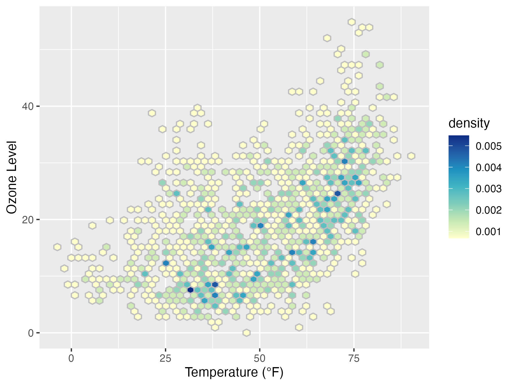
蜂巢图
主要是geom_hex(当然也可以用geom_bin2改成长方形的)
ggplot(chic, aes(temp, o3, fill = ..density..)) + geom_hex(bins = 50, color = "grey") + scale_fill_distiller(palette = "YlGnBu", direction = 1) + labs(x = "Temperature (°F)", y = "Ozone Level")
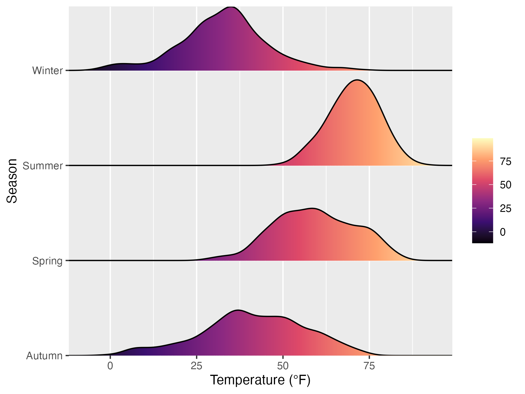
山峦图
library(ggridges)
ggplot(chic, aes(x = temp, y = season, fill = ..x..)) + geom_density_ridges_gradient(scale = .9, gradient_lwd = .5, color = "black") + scale_fill_viridis_c(option = "magma", name = "") + coord_cartesian(expand = FALSE) + labs(x = "Temperature (°F)", y = "Season")
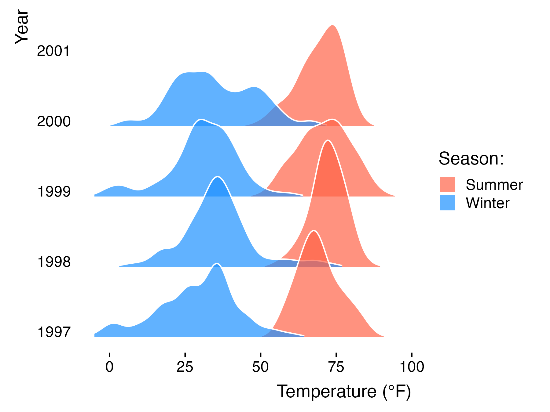
将两组数据放在一起
这个有点复杂,我也是参考教学代码写的,具体细节来说,前面都是和之前一样,scale_fill_cyclical是做颜色的轮转映射。
ggplot(data = filter(chic, season %in% c("Summer", "Winter")), aes(x = temp, y = year, fill = paste(year, season))) + geom_density_ridges(alpha = .7, rel_min_height = .01, color = "white", from = -5, to = 95) + scale_fill_cyclical(breaks = c("1998 Summer", "1998 Winter"), labels = c(1998 Summer = "Summer", 1998 Winter = "Winter"), values = c("tomato", "dodgerblue"), name = "Season:", guide = "legend") + theme_ridges(grid = FALSE) + labs(x = "Temperature (°F)", y = "Year")
这样,一些比较酷炫的图就这样能够参照着画出来啦。
